Legibility
Description
This section is from the book "Hill's Manual Of Social And Business Forms: A Guide To Correct Writing", by Thos. E. Hill. Also available from Amazon: Hill's Manual Of Social And Business Forms: The How-To-Do-Everything Book Of Victorian America.
Legibility
Legibility is of the greatest importance in penmanship ; and care should be observed to make each letter very distinctly what it is designed to be. While practicing with a view to improvement, the student should beware of writing too fast. The copies are very simple, and are easily imitated by the student who may give the subject earnest attention and care.
Proportion Of Small Letters
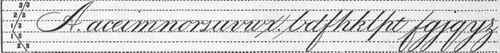
The following diagrams represent the relative proportion of the capital and small letters. As will be seen in the diagram for the finer hand, there are eight lines, containing seven spaces. In the middle space are made the contracted letters which occupy one space, excepting
and
which are a little higher. The
and
are each of the same height;
and
extend the same distance below the line. The loop letters are all of the same length above and below the line, the loop being two thirds the length of the letter. Capitals are of the same height as the loop letters above the line.
Relative Proportion Of Letters In Large, Round Hand
Elements Of Small Letters
By examination of the small letters of the alphabet, it is seen that they can be resolved into a few fundamental elements (or principles, as they are called by many teachers), being five in number, as follows :
The 1st principle,
is found in the following letters, viz : last of
completely in the
in the
with the lower part omitted; last of the
first of the
and
completely in the
completely in the
and last of
The 2nd principle,
forms the first of
and upper part of
The 3rd principle,
forms the lower part of
the lower part of
last of
and
and first of
and
The 4th principle,
forms the first part of
left of
lower part of
left of
lower part of
upper part of
the whole of
upper part of
and right of
The 5th principle,
forms the upper part of
and
Inverted, it forms the lower part of
and
General Hints For Small Letters
Be careful to close the
at the top, else it will resemble a
Observe the distinction between the
and the
The
and
are shaded at the top, and made square.
The
is crossed one third the distance from the top. The loop is of uniform length in all loop letters. Avoid a loop in the upper part of
and
The dot of the
should be at a point twice the height of the letter. Beware of making the extended letters crooked. The left hand mark of the loop letters should be straight, from the center of the loop to the line, sloping at an angle of 52 degrees. See diagram of slope. Figures are twice the height of the
Principles Of Capital Letters
No. 1.
No. 2.

No. 3.

The capital stem (see No. 1) can be terminated at the bottom, as shown in the first character. Observe in Nos. 2 and 3 the disposition of shades, curves and parallel lines. Their application in capitals will be seen in the next column.
Capital Letters
Three standard principles are used in the formation of Capital Letters, viz:

The 1st principle,

called the capital stem, is found in
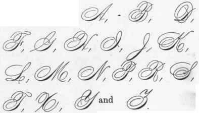
The 2nd principle,
occurs in

and
The 3rd principle,
is found in the upper part of


and
and forms the first of
and

Capital letters, in a bold penmanship, are three times the height of the small letter
Continue to:
My Books

