II. - The Materials Necessary For Pen Drawing. Continued
Description
This section is from the book "Arts & Crafts Magazine Vol1-2", by Hutchinson & Company.
II. - The Materials Necessary For Pen Drawing. Continued
We may now practise cross-hatching by horizontal lines, as in Fig. 4. Let the hand rest lightly on the paper in all these exercises. In Fig. 5 we have an example of cross-hatching with diagonal lines. The beginner has a tendency to curve his strokes; but he must overcome that, and accustom himself to make straight, even lines before trying curved ones. He may make the strokes up or down, whichever comes the easier to him.

Fig. 4. - Cross-hatching. Horizontal lines.

Fig. 5. - Cross-hatching: Diagonal lines.

Fig. 6. - Cross-hatching in curved lines.

Fig. 7. - Curved parallel lines.

Fig. 8. - Gradation of shadow by parallel lines.
When you are quite sure of your straight lines you may try parallel lines slightly curved, as in Fig. 7. Then, simple cross-hatching, also in curves, from left to right, as shown in Fig. 6. When you wish to deepen the shadow, you would make the third series of lines, as in. Fig. 10. You must take care to keep these strokes as uniform as possible, so as to preserve evenness of tone. If you are called upon at any time to represent undulations or unevenness of surface you will find it easy enough to get the effect of the shadows. But you will not, as a beginner, find it so easy to keep your tone uniform and pure.

Fig. 10. - Cross Hatching, for great depth of colour.

Fig. 11. - Lines suggesting convexity.
Another way to express shadow or depth of tone is by the thickening of the lines. In Fig. 8 note how this may be done with perpendicular lines. In Fig. 11 we have a suggestion of convexity given by slightly curving the horizontal lines, and grading them from thick strokes to thin, light ones. You may begin at the light end, and gradually thicken your strokes, or you may reverse the process - whichever you find the easier.
Very good practice in pen and ink work is afforded by drawing a ball like that in our illustration. Note that the darkest shadow is at the right, outside of the circle. The shading of the right-hand side of the drawing seems to have thickened a little in the reproduction. More roundness w o u 1 d have been suggested if the edge of it had been left white. In the representation of the leaves of the book the vertical boundary line, necessary in the preliminary pencil sketch as a guide for his pen work, might with advantage have been erased by the artist before the reproduction of the drawing. As we have remarked before, a continuous line should generally be avoided in showing the outline of an object.

Fig. 9. - Simple exercises for the Beginner.
More or less, in all the examples in the last row, the draughtsman has allowed the ink to thicken in his pen. This must be carefully avoided.

Fig. 12. - Still-life Study. By J. S. Eland.
(To be continued.)
Drawing is too often understood to be simply the drawing of an outline. Properly, it includes modelling - that is to say, it is the complete study of form. And in landscape the modelling is usually of more importance than the outline, even when an outline may be followed, which is not always the case. It were an impossible task, for instance, to trace the outline of a tree in full leafage; but its modelling - that is to say, the various degrees of projection of its branches, some catching the light, more or less, while others fall back in shadow - may be rendered with a considerable approach to exactness. And the minor forms of which those great masses of foliage are composed may be reproduced as to their shape and direction and degree of light and dark by separate touches of the brush. This is what makes "the touch" of such great importance in landscape. Do not suppose that it ever is, with real masters or conscientious students, a merely ornamental flourishing of the brush. Every touch should represent some actual portion of the object, approximately as to form, exactly as to tone of colour and degree of light or dark or value.
The Technique of Pastel is comparatively easy to those who are used to oil or water colours. The main difficulty with this attractive and charming medium is that one must be perfectly sure of what he wants to do and know exactly what shade to put on with each touch. This is a matter of experience and feeling. It is not possible, as in water-colour painting, to make a tone lighter or darker by taking a colour more or less thin or thick or by going over it twice. Each shade of a colour is represented by a separate stick, and it is therefore often necessary to use half-a-dozen different pastels to cover a square inch of paper, while in water-colour the whole space could be covered with one colour graded into different shades. In pastel, too, one must work as directly as possible; the work will look woolly if gone over too much, and besides, one will be apt to take the colour off instead of putting it on. Therefore, pastel is best adapted for persons of experience who have a thorough knowledge of colour.
A well-known portrait painter has disclosed to-the writer some of the secrets of his palette. For a grey background he uses white, black, a little Indian red, and yellow ochre. A yellow, suitable for rich, dark complexions, is composed of white, raw Sienna, and Vandyck brown. For olive (fair complexions), terre verte, Naples yellow, black, and white. Brown, suitable for auburn-haired persons, black and burnt Sienna.
A Picture should be finished in the frame. Such is the habit of Sir Laurence Alma-Tadema and many others of our best painters. It often saves work which might otherwise be thrown away, for One instinctively feels the need of a frame, and in finishing a picture there in a natural tendency to-paint the edges more carefully than even the centre, so as to isolate the picture from surrounding objects,, which is just what a frame is intended for.
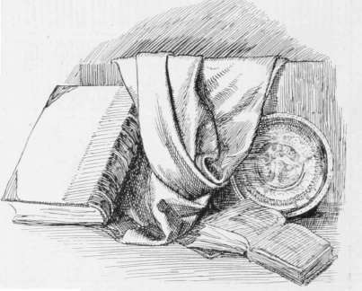
Fig. 13. - Still-life Study By J. S. Eland.
Introducing various kinds of shading by means of parallel, curved, or cross-hatched lines. The treatment of the drapery is worthy of special attention.

Illustration by the late Daniel Vierge for "Pablo de Segovia."
Reproduced from the Original Pen Drawing. (See page 50.)

Study, in Pencil, by Puvis de Chavannes.


Roses, Water-Colour Painting. By Frieda Voelter Redmond,
Continue to:
My Books

