About Type and Setting Type
Description
This section is from the "Handicraft For Boys" book, by A. Frederick Collins. Amazon: Handicraft for boys.
About Type and Setting Type
Relative Number of Type Letters
In looking over type catalogues you will see that the fonts are listed as 4A, or 8A-10A, etc. Now this means that in the 4A font there are 4 capital A letters and that all of the other letters are in proportion to the A's that are likely to be used, thus: a 4A FONT ABCDEFGHIJKLMNOPQRSTUVWXYZ
No. of letters 42335223422334432444222 222 to font
With an 8A-10a font there are of course twice as many of each capital letter as in a 4A font while of the lower case letters, which means the small ones, there are 10 a's and the number of the others are in proportion to their use, thus: an 8 A - 10a FONT a b c d e f g h i j k l m n o p q r s t u v w x y z
No. of letters 10 4 6 8 18 4 4 8 102 3 8 6 10 10 6 3 101010 6 4 4 2 4 2 to font
Styles of Type
For card work you want a plain block letter font like that shown at A, a script like B, or an old English like that shown at C.
For envelopes, bill, letter head and other job work three fonts of engraved plate style as shown at D, E and F will give good results.

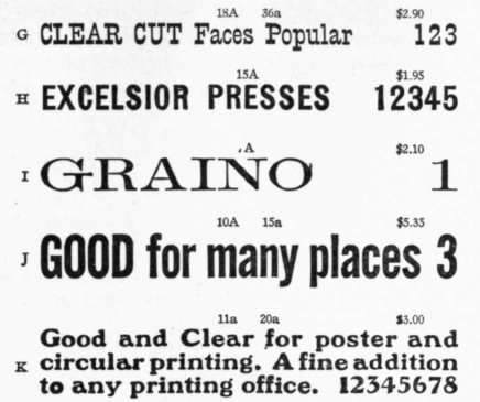
For circulars you should have several fonts of different styles of type as shown at G, H, I, J and K.
And finally should you intend to print a cook-book, a town directory or a newspaper you will need a half, or a full font of 12 point plain pica Roman, as it is called, and which is shown at L.
12 Point No. 1, 25 lbs. $12.00. (Half font, 12 1/2 lbs., $6.50)
PLAIN Pica Roman, a face for many uses. Books, circulars and jobbing. Very clear and easy to read. Cast from nickel metal and most durable known. L$Lz 1234567890
The Parts of a Type
Before explaining how to set type, make ready and print, there are a few little things about letters and about type which are good to know.
First let's take, by way of illustration, the letter H H. Now you will observe that the first H is plain and the second one is embellished by fine lines at the top and bottom and these embellishments are called ser'-ifs.
As simple a bit of metal as a type has more parts to it than you can shake a stick at, but you ought to learn them by heart. Named, these parts are (a) the body of the type; (b) the front; (c) the back; (d)

Fig. 65. The Parts Of A Type
the face or letter; (e) the nicks; (f) the feet; (g) the groove; (h) the shoulder; (i) the bevel, and (k) the pin marks, and all of these are pointed out in Fig. 65. It very often happens in italics and script type that a part of a letter will stand out beyond the body and this little extension is called the kern. The nick in the type is to help the type-setter, or compositor as he is called, to set the type the right way in the stick, that is you always set the type with the nicks down and toward you.
The pin-mark is made by a sharp instrument which removes it from the mold. Finally a c e m n o r s u v w x z are called short letters; j is a long letter in that it takes up the full breadth of the face; b d f h i l t are upstroke, or ascending letters, while g p q are downstroke or descending letters.
Continue to:
My Books

