Ornamental Lettering. Part 3
Description
This section is from the book "Modern Buildings, Their Planning, Construction And Equipment Vol1", by G. A. T. Middleton. Also available from Amazon: Modern Buildings.
Ornamental Lettering. Part 3
Note. All Half Timber To Rough Axed And Stained Dark. The Horizontal Pieces Tv Be Tenoned Into The Vertical Pieces Amd Fillets To Be Nailed To Both. To Form Key For Portlandcement Concrete.


Plate III. Asheet Of Renaissance Lettering:.

The small alphabet only approximates to that which it is best to employ with the capital alphabet above it, for it has been designed so as to be drawn almost entirely with the ruling pen, using the T-square and the 45° set-square only except for a few curves on the letters "e, g, h, s, y, and z." The necessary ruling for this alphabet is shown by the dotted lines at its commencement, to which another line might be added to denote the extremity of the tails of "f, g, j, p, q, y, and z." Had it been drawn freehand the alphabet might have been a good deal improved, and the direction in which this improvement might take place is suggested by the title at the bottom of the sheet, which, however, is again to a considerable extent drawn with the ruling pen.
Gothic letters are more adaptable to ornamental work than any others where the ornament is at all of the missal type, and is particularly useful for colour work, and for illuminating and engrossing.
Two variations are shown in the portions of sentences, one in outline and the other filled in, the latter having the small letters based more upon the Roman than upon the Gothic, although the harmony between them and the capitals is perfectly preserved.
Gothic capitals are particularly valuable for ornamental initials or versals - the initial being the first letter of a whole book or chapter, and the versal being the first letter of a paragraph. These need decorating in accordance with Gothic traditions, but there is no need to restrict oneself to precisely the forms of Gothic stone carving. Working upon a plane surface and in colour the circumstances are different, and the materials used must be kept in mind. They also combine well to form monograms, of which an example is shown, at the bottom of the sheet, in the Imperial monogram E.R.I., the letters being enriched with tracery and diaper, and filled with thirteenth century Gothic ornament. This may vary to any extent according to the draughtsman's skill.
If Gothic Lettering suits, woodwork, it is Renaissance lettering which can generally be employed best for metal-work, a small illustration of this being given in the date Ao. 1663, which is a Belgian example of strap iron.
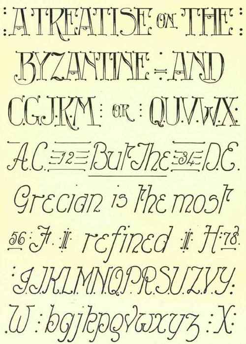
Modern lettering varies very greatly, but the general tendency is towards rapidity of execution and a certain complexity which is often difficult to decipher. Throughout this book there will be a large number of different styles illustrated upon the various drawings which will appear, and from amongst these it will be possible to choose, while each draughtsman is always at liberty to design for himself. In the examples illustrated here a little trouble has been taken to show a good modern ornamental alphabet which cannot be said to be definitely either Roman or Gothic in type, but a combination of both. The main alphabet of capitals has been half blocked in, this being a common modern expedient which looks especially well in pencil, but perhaps this particular alphabet errs on the side of fidgetiness owing to the large use of dots. For rapid and at the same time decipherable work of good appearance it is difficult to have anything much better than the type which makes up the words "Grecian is the most," if this be used without flourishes. All the other letters of this type, both capitals and small letters, as well as the numerals, will be found upon the page in one place or other, but there is no hard and fast rule, and it is possible to design or combine at pleasure. As an example of simple combination the way in which the three "n's" in the words "Byzantine and " are treated may very well be noticed. The title at the bottom of the page has again been employed to suggest another style of lettering, which, however, in unskilled hands may become exceedingly ugly. It is known as the Hatchet Lettering.
If lettering has to be used for anything else than pen, ink, and paper the limitations and needs of the material must be carefully studied before an alphabet is selected and its letters designed or modified. Stencil work in particular needs to be very carefully thought out, that the stencils may be cut so as not to be too fragile in any particular spot, and yet the letters when produced be without blemish. As is said in an important book on Alphabets, "The stencil letter should be clear cut, and somewhat blocked in, its curves having more the nature of an engraving than a painting about it; and ties, if rarely used, should either be pliable or form integral portions of some slight ornamentation."
Incised letters, such as those in stonework, are again different from carved letters, such as can be frequently used in oak and other hard woods, the grain of which will sometimes necessitate modification quite apart from any design prepared before the carver gets to work. Lacework, tapestry, and engraving on brass or copper all require different treatment.
Perhaps in modern work it is the placing of letters which is more often in fault than their form, there being many good modern alphabets, while a very large number of draughtsmen are capable of executing beautiful lettering. It is difficult to lay down definite rules, however, for the arrangement of the lettering on a drawing or upon such a specimen of the art as a title page. There is much in the selection of the letters and of their relative size, and in the choosing or modification of them to enable them to combine well.
If a number of lines of lettering have all to be of equal length it is sometimes difficult to arrange the spaces between the letters and between the words so as to accomplish this without unduly crowding one line or spreading out another. Where this result has to be achieved it is imperative to carefully do the work first in pencil, as it may need to be rewritten two or three times before a satisfactory result is obtained without resort to the separation of a word into syllables, or at any rate to its being split into two parts which do not divide well. To take a well-known example, the word "manslaughter" might very well by a careless draughtsman be divided into "mans" - "laughter." To take another example, in which there is no ludicrous result by wrong placing of the hyphen, the word "without" may be selected. It obviously divides properly into " with " and " out," but if there were not quite room for the "h" in the first line without redrawing the letters a little more closely, there are many lazy draughtsman who would separate it into "wit" and "hout."
Enrichments and flourishes should be very sparingly used upon lettering, whose prime function is to describe a drawing rather than to decorate it. In much modern work there is an unfortunate tendency to over-elaboration, and, as on the specimen Modern sheet, to employ strokes and dots to such an extent as to fidget. A few emphasising lines or rows of dots, such as appear upon the Gothic sheet, are occasionally useful, particularly when applied to the headings of "show" drawings, but upon working and detail drawings the less ornament that is attempted the better; and, in fact, upon large scale details, nothing is better than very large plain lettering, done straight away with the brush, a good large sable being used - such a tool as it is impossible to "niggle" with.
Well-selected, well-drawn, and well-placed lettering is an ornament to any drawing; and while the placing is largely a matter of taste, it should conform to the rules of balance and symmetry which are applicable to all artistic work. Attention may in this respect be drawn to the sheet of Gothic Lettering, in which the comparatively light work above is in appearance carried by the large monogram below, while the ironwork date is introduced to fill up a gap and balance the two sides without exact conformity.1
1 Many exceedingly beautiful and useful alphabets are to be found in the book by Mr. A. A. Turbayne, entitled Alphabets and Numerals, which is published by Messrs. T. C. and E. C. Jack, while the same author has produced a handsome series of volumes on Monograms and Cyphers, which includes almost all combinations of two and three letters. These are perhaps the greatest books on the subject which have yet appeared, and reference to them might be made by any who wish to carry the matter further.

Continue to:
My Books

