Gothic Lettering
Description
This section is from the book "Cyclopedia Of Architecture, Carpentry, And Building", by James C. et al. Also available from Amazon: Cyclopedia Of Architecture, Carpentry And Building.
Gothic Lettering
Gothic lettering is extremely difficult, and has little practical use for the architectural designer or draftsman. It is often appropriate, but it is quite possible to get along without employing this form at all. However, in case he should require a letter of this style, it would be bettor to refer him to some book where he may study its characteristics more particularly, remembering it is just as important he should know something of the history, uses and materials from which this letter has been taken, as in any instance of the use of the Roman form. Indeed, it might be said, it is even more important, as the Gothic letter is more universally misunderstood and misapplied than the simpler Roman letter.
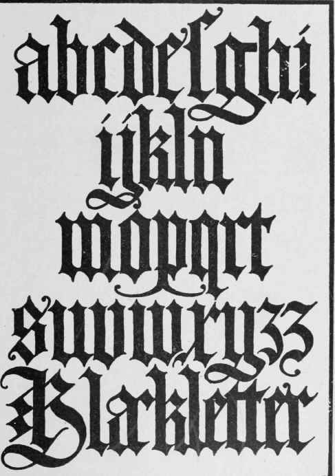
Fig. 35. Italian Black Letters, after Bergomensis.

Fig. 36. English Gothic Text.
The alphabet of German black letters shown in Fig. 35 is taken from a very beautiful example of Gothic black letter devised by Jacopus Phillipus Foresti (Bergomensis) and used by him in the title page of "De Claris Mulieribus," etc., published in Fer-rara in 1497. Although Italian, this letter is as German in character as any of the examples from the pen of Albrecht Durer. A German black letter redrawn from a brass is shown in Fig. 33, while an English form of Gothic letter is shown in Fig. 36.
In Fig. 34 is another example of a black-letter alphabet. The entire effect of a blackdetter page depends upon the literal interpretation of the title "black letter." That is, the space of white between and among the letters should be overbalanced by the amount of black used in defining the letter form itself.
Inasmuch as this letter is likely to be used but little by architectural draftsmen, and as it is a much more difficult form to compose than even the Roman type, it seems better to refer the student to some treatise where its characteristics are taken up more thoroughly and at greater length.
Any draftsman having occasion to use lettering to any extent should have some fairly elaborate textbook always at hand for reference, and it is believed that '"Letters and Lettering," a larger treatise published by the Bates and Guild Company of Boston, from which several of the illustrations reproduced in this pamphlet have been borrowed, contains more material in an easily available form than any other textbook on the subject.
Continue to:
My Books

