Color In Decoration. Continued
Description
This section is from the book "The House: Its Plan, Decoration And Care", by Isabel Bevier. Also available from Amazon: The House: Its Plan, Decoration And Care.
Color In Decoration. Continued
"Most of the bad or poor combinations may be made into agreeable harmonies when a third color is added to the group, which, on the other hand, may shatter the harmony of a pair that combine well together. Thus yellow with blue-green is a bad combination, but if violet is introduced the arrangement is excellent;. Scarlet and blue are a good pair, but if green or greenish-blue is added to make a triad, the combination will be disagreeable.
Table Of Agreeable Contrasts
1. | Heliotrope and light amber. |
2. | Violet and amber. |
3. | Violet and light yellowish-pink. |
4. | Ultramarine and dark yellow-green. |
5. | Grey-blue and light golden-ochre. |
6. | Plum-purple and orange-amber. |
7. | Plum-violet and sage-green. |
8. | Brownish-yellow and deep warm green. |
9. | Dull orange and slate-blue. |
10. | Dull indigo and dull orange. |
11. | Slate-blue and greyish-yellow-green. |
12. | Claret and buff. |
13. | Deep blue and yellowish-pink. |
14. | Chocolate and pea-green. |
15. | Maroon and warm green. |
16. | Black and bronze-yellow-green. |
17. | Deep red and medium grey. |
18. | Venetian red and grey-yellow-green. |
19. | Coral-red and turquoise. |
20. | Chamois and lavender. |
21. | Deep crimson and yellowish-green. |
22. | Deep golden-yellow and sea-green. |
23. | Golden-brown and olive-green. |
24. | Pale turquoise and pale orange. |
25. | Deep blue and yellowish-green. |
26. | Indigo and light olive-green. |
"All these color combinations would be improved if the colors were divided by lines of black, white, gold, or in some cases by a neutral grey.
"Any two colors, no matter how disagreeable they may look together, may be brought into harmony by the added help of another color in combination, and, generally speaking, it is not a very difficult matter to obtain the color that is wanted to complete the harmony. The chief thing to observe in the selection of any three colors, necessary to form an agreeable arrangement, is that each color, or tone of a color, should be selected from equally distant, or nearly so, positions on the chromatic circle, and what is almost of as great importance, is to have two of the colors in the arrangement selected from the group of the warmer colors. Not only do these conditions obtain in the natural laws of harmonious coloring, but we constantly notice this preponderance of warm colors over the colder ones, in the best color schemes of the great colorists and decorative artists.
"The old mosaics of the fifth century at Ravenna have color arrangements of blue, gold, and green; the green is yellowish in the lighter parts, and is gradated into the blue ground in certain parts of the design, and here the gold supplied the place of red or orange, the whole being a perfect harmony.
"The favorite triads of the best Italian painters were -
Red, blue, yellow.
Coral-red, ultramarine, orange-amber.
Scarlet, olive-green, violet.
Orange, green, violet.
Purple, yellow, grey-green. "In all these groups it will be seen that the warmer colors are in the ascendency, and each of the triads afford excellent color combinations".
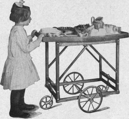
A BUTLER'S TRAY ON WHEELS Photograph Furnished by a Massachusetts Student of the A. S. H. E.
Continue to:
My Books

