On Colour And Composition. Part 4
Description
This section is from the "The elements of drawing & the elements of perspective" book, by J. M. Dent & Sons. Also see Amazon: The Elements Of Drawing & The Elements Of Perspective.
On Colour And Composition. Part 4
Brown madder.
Smalt. Gamboge. Cadmium yellow. Burnt sienna. Extract of vermilion. Burnt umber.
Antwerp blue. Emerald green. Yellow ochre. Light red. Carmine.
Vandyke brown.
Prussian blue. Hooker's green. Roman oclire. Indian red. Violet carmine.
Sepia.
Antwerp blue and Prussian blue are not very permanent colours, but you need not care much about permanence in your work as yet, and they are both beautiful; while Indigo is marked by Field as more fugitive still, and is very ugly. Hooker's green is a mixed colour, put in the box merely to save you loss of time in mixing gamboge and Prussian blue. No. I. is the best tint of it. Violet carmine is a noble colour for laying broken shadows with, to be worked into afterwards with other colours.
If you wish to take up colouring seriously you had better get Field's Chromatography at once; only do not attend to anything it says about principles or harmonies of colour; but only to its statements of practical serviceableness in pigments, and of their operations on each other when mixed, c given at the intersections, thus (the letters standing for colours):
b d e f c. | ||||||
a | a b | a c | a d | a e | a f | |
b | - | b c | b d | b e | b f | |
c | - | - | c d | c e | c f | |
d | - | - | - | d e | d f | |
e | - | - | - | - | e f | |
c. | ||||||
This will give you some general notion of the characters of mixed tints of two colours only, and it is better in practice to confine yourself as much as possible to these, and to get more complicated colours either by putting a third over the first blended tint, or by putting the third into its interstices. Nothing but watchful practice will teach you the effects that colours have on each other when thus put over, or beside, each other.
When you have got a little used to the principal combinations, place yourself at a window which the sun does not shine in at, commanding some simple piece of landscape: outline this landscape roughly; then take a piece of white cardboard, cut out a hole in it about the size of a large pea; and supposing r is the room, a d the window, and you are sitting at a, Fig. 29., hold this cardboard a little outside of the window, upright, and in the direction b d, parallel to the side of the window, or a little turned, so as to catch more light, as at a d, never turned as at c d, or the paper will be dark. Then you will see the landscape, bit by bit, through the circular hole. Match the colours of each important bit as nearly as you can, mixing your tints with white, beside the aperture.
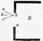
Fig. 29.
When matched, put a touch of the same tint at the top of your paper, writing under it: dark tree colour, hill colour, field colour, as the case may be. Then wash the tint away from beside the opening, and the cardboard will be ready to match another piece of the landscape.1 When you have got the colours of the principal masses thus indicated, lay on a piece of each in your sketch in its right place, and then proceed to complete the sketch in harmony with them, by your eye.
In the course of your early experiments, you will be much struck by two things: the first, the inimitable brilliancy of light in sky and in sun-lighted things; and the second, that among the tints which you can imitate, those which you thought the darkest will continually turn out to be in reality the lightest. Darkness of objects is estimated by us under ordinary circumstances, much more by knowledge than by sight; thus, a cedar or Scotch fir, at 200 yards off, will be thought of darker green than an elm or oak near us; because we know by experience that the peculiar colour they exhibit, at that distance, is the sign of darkness of foliage. But when we try them through the cardboard, the near oak will be found, indeed, rather dark green, and the distant cedar, perhaps, pale grey-purple. The quantity of purple and grey in Nature is, by the way, another somewhat surprising subject of discovery.
Well, having ascertained thus your principal tints, you may proceed to fill up your sketch; in doing which observe these following particulars:
1 A more methodical, though, under general circumstances, uselessly prolix way, is to cut a square hole, some half an inch wide, in the sheet of cardboard, and a series of small circular holes in a slip of cardboard an inch wide. Pass the slip over the square opening, and match each colour beside one of the circular openings. You will thus have no occasion to wash any of the colours away. But the first rough method is generally all you want, as, after a little practice, you only need to look at the hue through the opening in order to be able to transfer it to your drawing at once.
1. Many portions of your subject appeared through the aperture in the paper brighter than the paper, as sky, sun-lighted grass, c. Leave these portions, for the present, white; and proceed with the parts of which you can match the tints.
2. As you tried your subject with the cardboard, you must have observed how many changes of hue took place over small spaces. In filling up your work, try to educate your eye to perceive these differences of hue without the help of the cardboard, and lay them deliberately, like a mosaic-worker, as separate colours, preparing each carefully on your palette, and laying it as if it were a patch of coloured cloth, cut out, to be fitted neatly by its edge to the next patch; so that the fault of your work may be, not a slurred or misty look, but a patched bedcover look, as if it had all been cut out with scissors. For instance, in drawing the trunk of a birch tree, there will be probably white high lights, then a pale rosy grey round them on the light side, then a (probably greenish) deeper grey on the dark side, varied by reflected colours, and, over all, rich black strips of bark and brown spots of moss. Lay first the rosy grey, leaving white for the high lights and for the spots of moss, and not touching the dark side. Then lay the grey for the dark side, fitting it well up to the rosy grey of the light, leaving also in this darker grey the white paper in the places for the black and brown moss; then prepare the moss colours separately for each spot, and lay each in the white place left for it. Not one grain of white, except that purposely left for the high lights, must be visible when the work is done, even through a magnifying-glass, so cunningly must you fit the edges to each other. Finally, take your background colours, and put them on each side of the tree-trunk, fitting them carefully to its edge.
Continue to:
My Books

