Mechanical Drawing. IV. Objects In Section
Description
This section is from the book "Amateur Work Magazine Vol1". Also available from Amazon: Amateur Work.
Mechanical Drawing. IV. Objects In Section
Earnest T. Childs.
The work which has been taken up thus far by the student covers simply outline drawing, with very few concealed or dotted lines. To make the representation more complete it is often necessary to show the object in section ; that is, it is assumed that the object is cut at a certain point, and the drawing is made showing the exact shape of the object where it is cut off. For instance, if all the dotted lines in the upper left-hand view of the tee on page 41 of the December issue were shown full, this view would then represent a cross section of the tee. The use of sections is often very necessary to avoid the confusion of a great many dotted lines. There are several conventional methods of showing that the object is in section. The most common of these consists of parallel lines drawn usually at an angle of 45 degrees across the cut surface. When cross-sections of two different pieces adjoin each other, it is customary to draw the section-lines of one at right angles to those of the other, thus adding to the clearness of the drawing.
A
C
E
F
G
H
Figure 9.
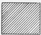
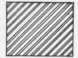
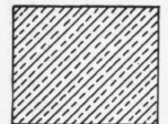
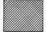
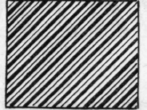
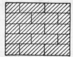
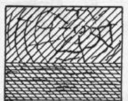
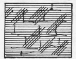
The representation of different materials may be indicated by varying the character of the section-line. There is no standard for the line which shall indicate a certain material. Every drawing room has its own standard, which may or may not agree with others, and if there is a possible doubt as to the material required, it should be indicated by a note on the drawing. Fig. 9 shows a very convenient set of conventional sections which are generally used, though they are not positively standard. A represents cast iron; B, wrought iron ; C, brass or bronze; D, babbitt metal, which is commonly used to line journal boxes; E shows steel; F, brickwork; G, wood, the upper part indicating that the section is across the grain, the lower showing that the section is with the grain of the wood; II shows stone. There are other graphic symbols showing concrete, earth, and other materials which it is not necessary to describe, the variety here given being sufficient for the needs of the ordinary draftsman.
The spacing of section-lines must be determined by the size of the section, but care must be taken not to space them too close, as this adds to the labor, and often draws undue attention to one particular part of the drawing.
The regulation of the space between section-lines is often left entirely to the eye, but if a great deal of sectioning is to be done, it is more readily and rapidly finished by the use of a section-liner.
There is a great variety of these instruments on the market, all of which are on the same general principle, and cost more than the amateur may care to pay for them. A simple liner may be made by any one by taking four pieces of wood, each about one-eighth of an inch thick and one and one-fourth inches wide, having both its sides parallel. These pieces should be about one and one-half inches longer than the 45 degree triangle, which is to be used for the section work. One side of each piece should be notched for a length varying from 1/32" to 3/16" longer than the triangle, and for a depth of about one-half inch. This will give four different widths of space, which will be ample for ordinary sectioning. A more convenient arrangement consists of a single strip of wood with an adjustable block on one end, so that by turning a small screw any width of space may be obtained. (See Fig. 10.) In using this arrangement it requires a little practise, but in a short time it will become an easy matter, and the relief to the eyes is very appreciable. The wood strip should be held against the blade of the T square to prevent it from getting out of line. The triangle and wood strip are moved along alternately, the stop limiting the motion and keeping it constant for each line. If it is thought advisable to purchase a section-liner, they may be obtained at any price from $1.00 up to $5.00, or even more. One of the neatest of the liners on the market is on the principle of the one shown by Fig. 10, except that the movable strip is secured to the inside of the triangle, and the adjustment is obtained by an eccentric-shaped metal piece, which will vary the width of the motion. This is known as Hill's combination section-liner and triangle, and lists for $1.00. Anything more elaborate will be too expensive for the ordinary draftsman.
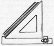
Figure 10.
An extremely important item in the making of a mechanical drawing is the class of letter to be used. The great majority of draftsmen can make a good line drawing, and can make fairly legible figures; but a great many find difficulty in making the notes and title uniform, and the skilled letterer always commands a good salary. It often happens that perfect lettering is not necessary for the work in hand. This is particularly true in the case of large manufacturing concerns who make drawings principally for shop or field construction. Municipal and private engineers often spend a great deal of time and trouble on their lettering and have specially trained experts who do nothing but this class of work. The ordinary draftsman, however, needs a simple letter which is readily made, and which is clear and legible without taking an unduly long time to learn the use of and to put on the drawing.
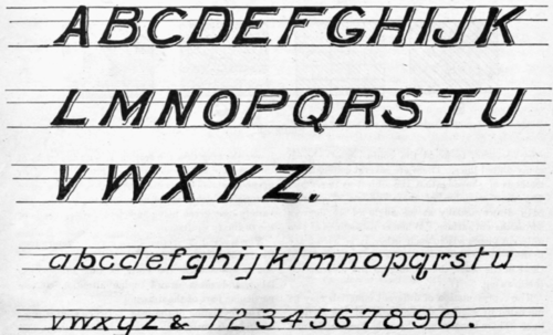
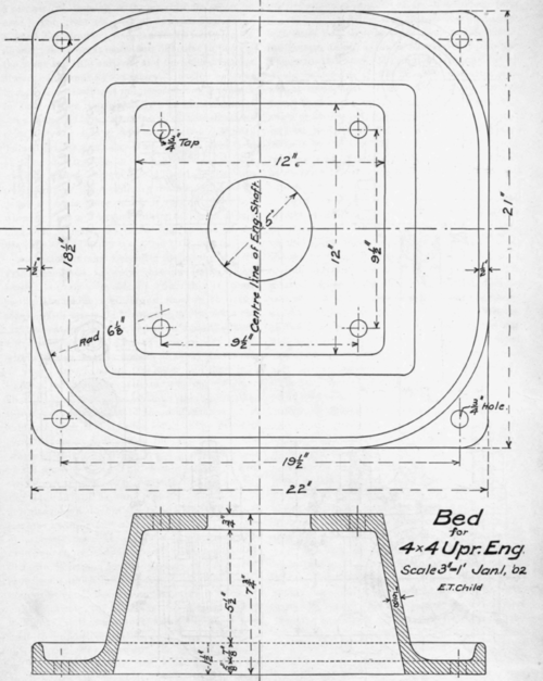
Figure 12.

As stated in the December issue, the writer's experience goes to show that an Italic Gothic letter, entirely devoid of flourish, is most readily handled by the largest number of draftsmen. With a few day's practise, a draftsman can make a neat looking title, and a new man, absolutely untrained, can be taught the use of this letter within two weeks. In a room of thirty draftsmen, all but two are handling this letter, and there is so slight a variation that it is next to impossible to know by the lettering which man did it. In other words, the individuality of the draftsman is not in evidence with this style of letter. The result is great uniformity in the titles and notations on the drawings and a correspondingly neat appearance of the drawing files. This alphabet, together with the figures appropriate to use with it, is shown by Fig. 11. It will be seen that the capital letters are made by a double stroke and are shaded, and the lower case letters are made by a single stroke of a coarse pen. It will be evident to all that these letters are made free hand. This is purposely done to illustrate to the student the degree of proficiency which is necessary to produce a neat note or title. Whenever any lettering is to be put on the drawing, the lines must be ruled, as shown in Fig. 11, so that the work will be even, as it is next to impossible to keep the work even unless this is done. For notes, etc., the capitals are made with a single stroke, unshaded, and for titles the small letters may be made heavier and the shade lines used. (See detail of Connecting Rod, Fig. 13.)
Special attention is called to the lines which form the letters. It will be seen that they are square at both ends and slightly wider than at the center, the bottom being a shade heavier than the top. This gives the lines character and balance, which would be missing if the lines were of the same weight throughout, or were made thicker at the center than at the ends. These letters stand at an angle of 60 degrees, but they may be written in a vertical position if desired. It is found more difficult by the majority of men to handle a vertical line than a sloping one, and the 60 degree angle is to be recommended particularly for this reason.
Fig. 12 shows the bed of the 4 x 4 engine. This illustrates the use of the section showing a symmetrical object. It will be seen that the section is taken on the center line of the base, at right angles to the shaft. The 1/2 inch head is shown in the plan, and the section shows its height as well as the general outline of the base. The section does not cut through any bolt holes, and they are shown dotted. It does, however, cut through the center of the 5 inch circular hole in the top of the base, and this part, not being cut, is not section lined. It will be seen that very few dimensions are necessary and repetitions are avoided. This drawing is exactly quarter full size and just fills a single standard sheet.
Fig. 13 shows the connecting rod. This is a good study, as it contains several interesting points and will give excellent practise. It should be drawn very carefully on paper, and then traced or inked in. Use tracing cloth if it is available. This gives a good example of the conventional representation of screw threads and bolt heads, and also shows check nuts secured by means of a split pin. This also illustrates one method of showing a section on a side elevation. The cross-hatched circles near the ends of the rod show that the rod is cylindrical at that particular point. Some of the figures are repeated on the various views. This should be avoided as much as possible, but it is better to repeat than it is to omit figures. These two details should be carefully worked up, and when inking do not forget to put in the circles first, and the straight lines afterwards, and use different weight of lines on dotted and full lines. It will also be well to make a practise sheet of cross-hatching after the idea of Fig. 11.
Continue to:
My Books

