


Printing For Beginners. III. Cases, Stands and Other Furnishings
Description
This section is from the book "Amateur Work Magazine Vol3". Also available from Amazon: Amateur Work.
Printing For Beginners. III. Cases, Stands and Other Furnishings
Frederick A. Draper
To separate words and characters, spaces of varying width are used, the thinner ones being termed spaces and the thicker, quods, shortened from quadrates. In shape they resemble the type, but are shorter and thus make no impression on the paper. The spaces are fractional parts of the em quod; hair line, eight to the em ; thin, five to em ; middle, four to em ; thick, three to em. In addition is the en quod, one half the thickness of the em quod.
Spaces and quods are not included in fonts of type, but must be ordered separately, one pound to the font being the minimum quantity for satisfactory work, and double this amount or more will often be required. They can be purchased in fonts containing an assortment of each size of spaces and quads, or any one size may also be ordered in quantity as desired.
Additional very thin spaces cast in copper, one-half and one point in thickness, are much used in justifying lines in advertisements, and also for separating letters in a line to make it more extended. The thick space is the one most commonly used for separating words, and nearly one-third the amount purchased should be of this size. The em quad is used to separate each sentence in a paragraph, also to indent the beginning of a paragraph, and the wider quads to fill out a line not fully occupied by type.
Type, for convenience in handling, is laid in cases which are manufactured in numerous sizes and arrangements of pockets. Body type, or type of which any considerable quantity is required, is laid in a pair of " News " cases; the "Upper case " containing the large and small capital letters, brackets, dashes and less used characters; and Lower case " containing

Cap or Upper case.

Lower Case.
the small letters, figures, spaces and quads, punctuation marks, and a few characters. The places occupied by these cases on a "Stand" is indicated by their names, the upper case being at the back, and the lower case in front.
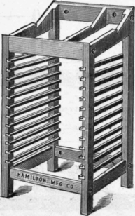
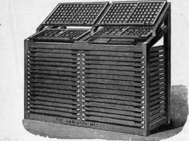
Unless room is greatly restricted or the type outfit an extremely limited one, type should be laid in full size cases. "Two thisd" cases are convenient for single fonts, and are suitable for amateurs' use, but preferance should be given to the larger cases. For job fonts containing no small capital letters, the arrangement known as a "California Job" case is the one most generally used. Old cases can be purchased of dealers in second hand materials, but California job cases are so much in demand that new cases will probably have to be purchased. Two third cases can often be found second hand, and a considerable saving is effected when these are obtained, the usual price for second hand cases in good condition being one-third the list price of new cases. A stand can be made for storing cases, one working stand being pur-

California Job Case.
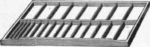
chased, and here again the second hand dealer can be visited to good advantage. A lead and slug case is also necessary, and is a labor saving devise well worth the small sum required for its purchase. A special
Lead and Slug Case.
case for fractions is desirable if work is done which requires their use to any considerable extent. Figures for time table and similar tabular work are usually laid in a special case. Type is composed or "set" in
Single Stand.
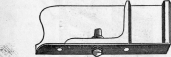
a composing stick, an assortment of sizes being desirable according to the amount and variety of the work. The kind known as a "Screw" stick is the best for regular work in which the measure is not changed. The "Yankee" stick is used for job work and advertisements, as alterations are quickly made.
Reglets are strips of oiled, hard wood about 5-8 of an inch in height, and used for separating lines or sections of type matter, and for filling out the space in the chase preparatory to " locking up " for the
Double Stand.
press. The commonly used widths are 6, 8, 10, 12, 18, 24, 36, 48, 72 and 144 points, each strip being a yard long. Reglets are of more particular value on odd jobs, where the use of leads would mean the cutting of many pieces not generally usable in other work. The wider pieces are also termed "furniture" and cabinets filled with the more commonly used lengths and widths are to be found in most job offices. The sizes most likely to be of use to the small office are the 6, 12, 24, 48 and 144 point widths, the lengths being cut as required.
Screw Composing Stick.
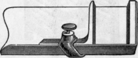
Yankee Top Stick.
Leads are strips of metal, similar to type metal, of varying thickness and used to place between lines of type to separate them. The stock thicknesses are 1, 2, 4, 6, 10 and 12 points, those 2 points thick being commonly used for single leaded matter. If a lead cutter is included in the outfit of an office, it is best to buy leads in the regular lengths of two feet, and cut it up as needed. It is important that the lengths be multiples of pica ems. As steel measures of the various lengths are expensive, a cheap substitute is to purchase at a type foundry one each of the different lengths of 12 point leads or slugs. As these are machine cut with smooth ends they serve the double purpose of guages for cutting leads and setting the measure of composing sticks. These guage slugs should be handled carefully, and used for no other purposes than those just mentioned.
Furniture is also made of metal, and a suitable stock should form a part of every office equipment. It greatly facilitates the adjustment of cuts, and as it has even and square surfaces, enables a firm " lock up"to be secured where the lines are other than of uniform length. A piece of metal furniture is usually placed at the foot of the standing matter on a galley to keep it in place when handling.
The more generally used materials having been described, we can now consider the handling of them. Upon receiving a font of type from the foundry, the first thing is to lay it in the case. The paper covering is removed by unfolding in such a way that the last turn removed will leave the type face up on the galley with the paper underneath. Slightly moisten the type with a wet sponge, which causes it to cling one to another; otherwise the characters at the ends are quite likely to fall over. Then draw the wrapper from under the type, using care not to upset it. In many offices it is customary to take a proof of the font before throwing in, to ascertain if all the characters are included. Also, if the font is to be added to others of the same kind already on hand, examine the nicks and shoulders of the lower case " m " and cap. "H" to see if the new font is identical with the old. When ordering type, about which any uncer-tainity exists as to kind or face, it is customary to send to the foundry as samples the two letters above mentioned.
An inspection of the font having shown it to be correct, it is then placed in the case, the compartments for the several characters, if a job font, being located as shown in the illustration. While at first, the pecu-liar arrangement may seem confusing. A little experience will show that the main purpose is to save labor by reducing the distance the hand moves in securing the type. It will be noted that the cap V is located between the T and W, the V being underneath the T. In some offices this arrangement of the two letters is reversed, and the writer has a preferance for the latter way.
Probably the easiest way to " learn the case " is to place the lettered diagram in a position where it may be easily seen, and begin setting type by its aid. Certain letters, such as b, d, p, q, will confuse at first. These letters may be known by remembering that type b looks like printed p, and d like q, and visa versa.
Continue to:


My Books

