The Dominant Hue. Part 4
Description
This section is from the book "The Principles Of Interior Decoration", by Bernard C. Jakway. Also available from Amazon: The Principles of Interior Decoration.
The Dominant Hue. Part 4
The painter produces his color effects with paints, of which one hue costs little more than another. The decorator, on the other hand, produces his color effects with textiles and other materials, of which some are enormously more expensive than others. For this reason the amount of money available for the decoration of a given room is often an important factor in determining, or at least in limiting, the choice of the dominant hue. In the first place, many of the more subtle and beautiful colors can be found only in costly pile fabrics or damasks. In the case of floor coverings, many of these colors are never to be found in stock at all, and they can be used by the decorator only when there is both money and time to have rugs specially woven to order. Such colors as jade, reseda and vert antique among the greens, or apricot, copper and rose-red among the reds, are ordinarily confined to specially made and costly rugs and plain carpets. If they are stocked at all it will be only in weaves too expensive for use in ordinary homes.
Moreover, some colors look well in cheap materials, while others do not. For example, calcimine colors, which are very much cheaper than either canvas and oil paint or good wall paper, are pleasing in practically all the variants of yellow; but they are unpleasing in the variants of red and blue, including pink, rose, lavender, heliotrope, azure, and the soft, light blue-greens. Pale tints of blue or red are of questionable value as wall colors in any material, since pink keys up the nerves, while pale blue is associated in the mind with the idea of illimitable spaces, whereas the very nature of a wall is to be fixed and confining. If, however, these colors are insisted upon for wall use, they must be employed in materials richer in appearance than calcimine.
In cheap textiles of all kinds pale tints of red, blue and violet are likely to be difficult to find and totally lacking in distinction, while the colors themselves fade quickly. Exception to this latter statement must be made in favor of the so-called Sundour or Sun-fast drapery stuffs, which are warranted to be fast to light. Few of these fabrics, however, have in the less expensive qualities any marked beauty of texture, and all have the serious defect of losing such beauty as they may possess when held against the light, which is of course precisely where draperies have to appear during the daytime. It may be noted that when these fabrics are made up without lining they must have ample fullness, so that the folds will help to shut out the glare of light and thus to enrich the texture as seen from the room.
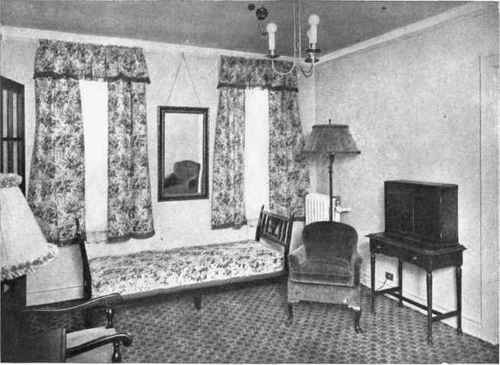
Plate XI. - The side hangings are here so wide as to rob the window treatment of a dominant element. They should be pushed farther back at the top or else caught back at a point either below or above the horizontal center of the window. (Compare Figures 16 and 51.) Note also that the outer lines are crooked and sprawling, so that the hangings do not help to define the structure of the room, but rather tend to render it amorphous.
As a general rule, it may be said that in cheap textiles of medium tone the variants of yellow or orange are the richest and most satisfying. Red appears to advantage only in relatively expensive materials, and the same is true in less degree of violet and blue. In most inexpensive fabrics the tints of a hue are more pleasing, though less stable, than its shades.
It is a characteristic of many housewives that they are unwilling to recognize the fact that certain color schemes can be worked out successfully only in costly materials, and that when such materials are too expensive another treatment must be substituted. Many of the very charming color schemes described in books or magazines were carried out in materials unavailable to the one who tries to copy or adapt them to her own home, and the use of cheaper substitutes can result only in disappointment. It is far easier to-day than it was a decade or two ago to give a room beauty of coloring through the use of relatively inexpensive materials, if one is willing to modify the scheme to fit the materials. The wise housewife will accordingly recognize the fatuity of trying to make gilt do the work of gold, and employ her ingenuity and taste in making her home attractive with such things as she can afford to pay for.
In conclusion, it is to be remembered that the colors have certain psycho-physical properties, and that in the case of invalids and persons suffering from nervous disorders these properties will influence and often determine the choice of the dominant hue. The red-yellow-orange end of the spectrum is warm and active, while the blue-violet end is cold and passive. People normally feel aggressive and inclined to vigorous action when surrounded by red, and passive, with a tendency toward depression, when surrounded by blue. In the language of the laboratory, the warm colors are dyna-mogenic in their effect. They tend to develop nervous energies and to intensify those already under way, while those of the blue end tend to reduce or to inhibit such energies.
Continue to:
My Books

