Colour And Its Relation To The Decorative Idea. Part 10
Description
This section is from the book "Interior Decoration: Its Principles And Practice", by Frank Alvah Parsons. Also available from Amazon: Interior Decoration: Its Principles and Practice.
Colour And Its Relation To The Decorative Idea. Part 10
The danger of upsetting completely the room scheme by the use of the wrong colour in a lamp shade, the wrong window hangings, or any other thing through which light is filtered, is increased tenfold when the background is too intense in colour. Remember that the background of a room must be less intense than the objects which are to appear against it, or the objects themselves lose their force as decorative things.
It is well probably to notice here a reason for the one striking difference between a warm and cold background in its general colour effect.
All good decorators and artistic people in general know that there is a pleasanter general aspect in a room where the background is keyed to yellow or orange rather than to green or blue; that is if the background is gray, or so nearly so that it seems to be gray. It is difficult if the gray is a blue gray, or in other words a neutralized blue, to get between the objects of furniture and the room a general effect of colours keyed together. On the other hand, if the gray is a yellow gray or orange gray, be it never so nearly neutral, there seems to be in this colour itself an invitation to furnishing objects to become a part of the general scheme of colour.
This is due to two facts: first, all wood naturally falls into the warm side of the spectrum, highly neutralized. Floors are usually treated in warm colour, and often many of the other decorative colours in the room are on the warm side of the spectrum. This establishes a common element or a relationship which at once invites harmony. If into such a room blues or greens are introduced, it is usually in upholstery, hangings, rugs, or other decorative features, and one can afford to em-50 phasize the decorative feature by exactly that contrast, while the constructive features would outline in an ugly manner against the background if the same contrast were introduced in their case.
Another reason why the warm tones are in general more satisfactory is that the kind of reflected light which they radiate as natural light, which is very often cool, cold, and forbidding, is reflected from them. It also simplifies keying with shades when artificial lighting is required.
This explanation will make it easier for any one who feels the lack of relationship existing between furnishings and background to select or treat backgrounds in such a way that the furnishings of the room are more harmonious. They may thus without effort be drawn into the general scheme of unity in colour which every good room must express.
There is one other aspect of colour that we must touch upon here so that the thought of colour as it relates to the decorative idea may be more nearly complete. If, however, each subject were explained and illustrated in all its possible phases, it would require a separate volume.
History is a record of the lives or activities of peoples of an earlier time and of the civilization they have evolved. It is expressed in literature, music, architecture, sculpture, furniture, textiles, and also in the lesser crafts. Its art expression has been unlike in different eras, and quite dissimilar in the case of diverse nations, while individuals of the same nation have frequently shown distinct variations.
Perhaps the national feeling for a type of expression may be as easily seen in colour as in any form of expression. How this national preference, when acting with other concrete forces, has produced periods in art and historical or decorative styles, is a matter for later consideration. Now, however, it is pertinent to see something of the way colour has expressed the standardized quality of feeling which a nation possessed at the time the period form was crystallized.
The people of the Spanish Peninsula have for many centuries been quite unmixed, since the Moorish invasion, with races of different blood. Different ideals and customs, native instincts, climatic conditions, partial isolation and the religious and social practices of these people have all tended to establish and maintain certain unbroken traditions in all forms of expression. The result of traditional living, inherited and promoted by environment, tends to establish a national temperament. We all recognize the extreme fondness of such races for intense colours and almost always colours on the warm side of the spectrum circuit. The use of yellow, red, and orange to excite the already infuriated bull is one of the visible manifestations of the conscious knowledge on the part of the people of the effect on the animal instinct of these warm colour combinations. Colour is a stimulant to the aesthetic sense. It is certain that this race of people is stimulated by these colours more than by cold colours; hence the choice of red, yellow, gold, orange, etc., in so much of the art expression of their period styles.
The natives of Italy are a far less homogeneous people. Southern Italy - so thoroughly Greek at times as to be almost a part of Greece itself, and influenced always by the Orient and the African Barbary states has the Oriental colour ideas prevailing in its earlier art expressions as well as in its colour choice of to-day. Northern Italy, on the contrary, less influenced by the Greek and the Orient, less mixed in blood with those countries, more open always to invasion from the north, and more blended and involved with the Teutonic idea, has developed a love for cooler colours. It perhaps exhibits a wider range, or at least a more refined conception of relationships in values and intensities.
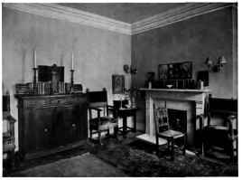
MAN'S STUDIO LIVING-BOOM, SHOWING HOW A LARGE NUMBER OF OBJECTS MAY, THROUGH THE PRINCIPLES OF GROUPING, BE SO ARRANGED AS TO GIVE THE EFFECT OF SIMPLICITY, QUIET AND DIGNITY THROUGHOUT. CEILING, WALLS AND TRIM A SOFT, WARM GRAY, PRACTICALLY THE SAME TONE. THE FLOOR A DARKER TONE IN THE SAME MODE. NOTICE RELATIONS OF DISTANCE BETWEEN PICTURE AND MANTEL; TERRA COTTA AND TABLE; GOTHIC.
Continue to:
My Books

