Colour And Its Relation To The Decorative Idea. Part 6
Description
This section is from the book "Interior Decoration: Its Principles And Practice", by Frank Alvah Parsons. Also available from Amazon: Interior Decoration: Its Principles and Practice.
Colour And Its Relation To The Decorative Idea. Part 6
Rugs are probably more often badly related in values than any other one article used in furnishing a house. The epidemic of Oriental rugs has been so severe in the last twenty-five years that the term and cost have become synonymous with the idea "effective floor covering." The floor is, as previously remarked, covered for comfort and to make it more beautiful by softening the wood appearance, and adding texture.
The idea of comfort and luxury in sitting or walking has brought the rug into universal use. Oriental rugs were not, for the most part, produced in response to the need which has just been mentioned. Various forms and decorative motifs have been created, some for their religious significance, some as family symbols, and others out of totally unrelated art expressions. They have been woven in rug forms much as the Gothic spirit expressed itself in tapestries, the Renaissance in carved wood and chiselled stone, or New England Colonial architecture in bricks and white marble. The unrelated and confusing medallion and shapes of that sort must be so closely related in value that they are not only inconspicuous but almost eliminated before the rug has any of the qualities necessary for harmonizing it with the floor or with the structural characteristics of the furniture to be placed upon it. This is particularly evident where patterns appear on backgrounds of white, light yellow, or other strong values that make the pattern more important than is the structural edge of the rug upon the floor.
These distracting shapes are often the reason for an unrestful, undignified, and inartistic impression one has on entering even the most luxurious of modern houses. Since the floor is a background, since chairs must be seen upon it, as well as people, and since it is unimportant as a show place when compared with the walls, it must be as inconspicuous as they are in value relations. This rule might be applied to each article in the room, but perhaps one or two more concrete instances may make the meaning clearer.
The Italian Renaissance developed probably the most dignified, strong, and formal chair the world has yet seen. It was also, in proportion, one of the most beautiful. Its wood was dark in value and it was covered, until the decadent period, in a dark red, green, or blue tone. This value differs little, if any, from the wood itself, but emphasizes the decorative idea by change of hue and intensity only.
There was a time - and the fad is still cherished by some people - when pictures, particularly prints, photographs, and engravings were matted on white. When a brown photograph is mounted on white and a dark brown frame is placed around (which should always be the case), the strongest contrast is found where the frame and mat meet. "Strongest contrast" means "strongest desire to look." Granting that the picture is the thing to be seen and that the strongest contrast between the picture and its adjacent environment would draw the attention of the observer to it, the mat is not only a non-essential but a positive hindrance to a proper appreciation of the picture itself.
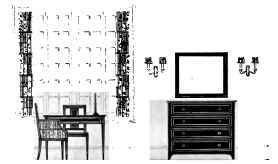
ELEVATION SKETCH IX BLACK, WHITE, AND ONE COLOUR, EXPRESSING THE FEELING OF A YOUNG BOY'S BEDROOM, DECORATIVELY CHOSEN AND ARRANGED, IN OCCULT BALANCE.
Applications of this idea of close value relationships where things should be unobtrusive and should possess wider value contrasts, where the desire to emphasize is compatible with good taste, establish a standard of judgment or criticism which any person may use on any room with effective results.
The third colour quality is called intensity. This quality takes its name from the colour itself, and relates to its vitality or individual strength. In common parlance we speak of brilliant colours and soft ones, sometimes of brilliant and pastel. This quality is the one which shows how much vitality or personal force a colour tone possesses. Full intense colours, particularly those spectrum hues which have been discussed, express in the strongest way the idea for which they stand.
For example, a normal blue, which is blue at dark in value, is at its fullest intensity; that is, it is as forceful a blue as can be made. If I make it lighter I weaken it by putting white or water into it. If I darken it I also weaken it, because I must do so with black, it being just as full of the colour itself as it can get. This same thing is true of all other colour hues at their normal maturity point.
Black, which is the absence of colour, should be understood here because it is this tone which absorbs colour when it is brought in contact with it as a surface. For example, colour is stronger displayed on white than it is on black, all things being equal, because white does not absorb and black does. An illustration of this is seen in its application to persons. White, worn next the face, leaves all the colour the individual has apparent to an observer. Black absorbs or extracts colour and, for most people, is impossible when in contact or close juxtaposition to the skin of the face.
It is essential to remember this in the treatment of colour in relation to its intensity quality. Pairs of colours, or opposite ones, in the spectrum circuit, are called complements. One colour complements another because it contains always the two other elements which its opposite lacks. For example, orange is made of equal forces of yellow and red. Its complement is normal blue.
In the pigment circuit purple is the union of equal forces of red and blue. The missing element, yellow, is its complement. While green unites in equal power yellow and blue, the missing element red complements it.
Since yellow, red, and blue fused in equal forces produce a neutral gray, green and red mixed in the same way also produce gray. This is equally true of orange and blue, of purple and yellow, and, in fact, of any opposite spectrum hues, such as yellow orange and blue violet, yellow green and red violet, red orange and blue green. Each of these pairs neutralizes the other and is, therefore, complementary in its relationship.
Continue to:
My Books

