Color Harmony. Part 2
Description
This section is from the book "The Principles Of Interior Decoration", by Bernard C. Jakway. Also available from Amazon: The Principles of Interior Decoration.
Color Harmony. Part 2
The next step in increasing the diversity and interest of the color treatment is to add the extreme red and yellow hues of orange, and to bring in sharper accents of color, as in the substitution of old gold, burnt orange or henna for some of the brown areas in hangings, lamp shades, cushions, or upholstery fabrics.
The third step is to include both red and yellow, colors which lie on either side of the dominant hue and share in its composition. Thus we could do a library in walnut or fumed oak woodwork and furniture, golden-yellow grasscloth walls, old ivory ceiling, orange-red Khiva or chenille rug, brocade hangings of old gold and orange red, porcelain lamps in old Chinese yellow, with maize silk shades, and sunny or ruddy-hued pictures framed in antique gold; or a dining room in paneled walls of Italian walnut, modeled plaster ceiling in antique ivory, carved walnut furniture, henna or Venetian red carpet, dull orange taffeta under-curtains, and hangings and furniture coverings of old red and gold damask.
If, however, we do not like red, or consider that its use would make our room too warm, it is equally easy to turn in the other direction on the chromatic circle to yellow-green, which is related to yellow-orange by the common strain of yellow. Thus olive, a tawny, yellowish-brownish green, may be substituted for the golden brown of the carpet in the room first described, as olive edged with old gold, olive and gold, or old gold edged with olive, may be substituted for the hangings. This would give us a room in which the principal areas were as far apart as yellow-orange and yellow-green, while the gamut of related colors may be further extended in either direction in the accents and small masses. A little blue-green, for example, combined with olive and mode, could be used in tapestry furniture coverings, while old red could be introduced in pictures, potteries, or book bindings.
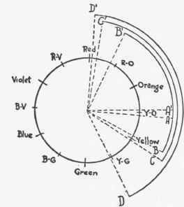
Figure 44. - Starting from a single hue the arc of the chromatic circle included in harmonies of analogy can be progressively widened until almost all of a half-circle is included. A-A', narrowest interval, employing one hue only; B-B', arc widened to extreme variants of orange; C-C, arc widened to include both red and yellow; D-D', arc widened to include both red and green - provided, however, that both are keyed to yellow, as Venetian red and olive green.
These harmonies differ in diversity and animation, but all are alike in that they are related by ties of common blood. Similar analogous harmonies may in theory be built upon tones of any hue or gamut of related hues, but in practice they are restricted to gamuts in which the warm hues play a large if not a preponderant part. Thus we may have analogous harmonies built up of hues lying between red and blue-green on the warm side of the circle. Between red and blue-green on the other side of the circle the colors are too cold to be agreeable in harmonies of analogy; so far, at least, as the larger areas of interior decoration are concerned.
Harmonies of this character are the easiest to produce, since their creation does not necessitate the possession of a flair for color or a highly cultivated taste, but only common sense and freedom from color blindness. Harmonies of analogy are also quiet, restful and subtle. Through the absence of that sense of activity which results from strong color contrasts, these harmonies not only make a room more reposeful but more spacious, and are therefore in general to be chosen for rooms which seem small or overcrowded with furniture, as well as for those wherein repose is the first consideration. Moreover, since the colors employed are markedly alike in emotional effect, harmonies of analogy must always be employed in rooms which are to be invested in the maximum degree with a particular emotional quality - that is, in rooms in which what is known in the studios as the temperamental idea is to be expressed. The highest beauty of analogous harmonies depends upon perfect keying, or infusion of the dominant hue into all the subordinate hues in such a way as to give an effect of atmospheric coloring, as if the room were seen through a delicately tinted glass. It is, of course, clear that the atmospheric effects characteristic of perfect coloring are difficult for the beginner to manage. They can in fact be produced only when broken and grayish tones of the hues employed are used skillfully. Thus in the room last described the old red and the olive appear much as vermilion and emerald would appear if seen through a haze of grayish yellow, and even the blue-green of the tapestry must be sufficiently broken with gray to make it look like a dull blue seen through this same gray-yellow haze.
All harmonies of this class, as described above, reveal a characteristic lack of snap, and none would be accepted by the mind as wholly satisfying. This defect is due to the total absence of the complementary of the dominant hue, which ought to be made to appear in some form, however unimportant, in every color scheme. Physiologically the color nerves require to be refreshed, while psychologically the mind requires to be relieved and stimulated by a note of strongly-contrasting color, as by an occasional high or explosive note in an even melody, or a patch of shadow on a sunlit field of grain. Thus in the dining room described above, wherein warm browns, old ivory, orange, old gold and Venetian reds were used together, the decorator would also introduce a note of blue in Venetian glass or majolica, and would probably echo this note in the border of the rug, in some detail of the cornice boards that support the hangings, and in some part of the design of the parchment masks or shades of the lighting fixtures.
The amount of the complementary introduced into a room may vary anywhere from slight accents up to a third or even more of all the colored surfaces of the room. When there is only a little of it the harmony remains one of analogy, set off by touches of its complementary; when there is a lot of it the harmony becomes one of complementaries, or contrast. In harmonies of this kind, two important colors only are employed, although small accents of other hues will of course be introduced into the room. Complementary harmonies are relatively easy to produce, and may be varied easily and safely from simplicity to relative complexity to accord with personal feeling and the decorative or emotional requirements of the room. They are less subtle and less restful than harmonies of analogy, but more animated and more brilliant. Moreover, since a pair of complementary colors are necessarily unlike emotionally - if one is warm and exhilarating the other is cool and tranquillizing - harmonies of this type are incapable of expressing the temperamental idea.
Continue to:
My Books

