Color Harmony. Part 3
Description
This section is from the book "The Principles Of Interior Decoration", by Bernard C. Jakway. Also available from Amazon: The Principles of Interior Decoration.
Color Harmony. Part 3
The real difficulty in the creation of these harmonies is to fix upon the complementary of the dominant hue. In the chapter on color it was pointed out that there is a difference between the scientific facts of color and the working explanation of color phenomena formulated by Chev-reul and generally adopted by artists and color workers, and, for the sake of simplicity and helpfulness in practice, adopted also in this study. At this point, however, even at the risk of some confusion in thought, it seems desirable to introduce the color chart, published in Von Bezold's Theory of Color, in which the true scientific complementaries are indicated by straight lines drawn from any point on its circumference through the center of the circle. The opposing pairs of colors thus obtained are true complementaries because each pair, when mixed as colored lights, yields white light. Nevertheless, color workers have found that in practice true complementaries for the most part make disagreeable contrasts, and that these contrasts are far more agreeable esthetically when the opposing colors are placed a little nearer together on the warm side of the scale. Thus vermilion red is more pleasant with green than with cyan, or blue-green; orange is more agreeable with ultra-marine than with turquoise or greenish-blue; and yellow is more pleasant with violet than with blue. For this reason we are warranted in accepting as complementaries the pairs opposed to each other in Figure 45.

Figure 45. - The straight line P-P', rotating on C as a pivot, indicates the pairs of pigmental complementaries.
It appears from the study of Von Bezold's chart, however, that between violet, purple and red there are differences far greater than those between their scientific complementaries - a circumstance that makes the use of green in complementary harmonies very difficult. Neither painters nor decorators have used this harmony to any great extent, probably because of this difficulty, and it is a safe rule of practice to confine the use of green to harmonies of analogy or to the triads. Contrasting harmonies of yellow-green and purple, yellow and violet, yellow-orange and violet-blue, and orange and blue are much easier to manage.

Figure 46. - A free adaptation of Von Bezold's chart. Colors lying on opposite sides of the center are accurately complementary.
The triads or trichromatic harmonies are based upon arrangements of any three hues that are equidistant and therefore lie at the points of an equilateral triangle inscribed within the chromatic circle; as, for example, red, blue and yellow. If one member of a triad is changed in hue to right or left each of the other two members will normally be changed equally in the same direction. Thus we may have triads in red, blue and yellow; red-orange, yellow-green and blue-violet; orange, green and violet; or yellow-orange, blue-green and red-violet. In addition to these triads others may be devised by skilled colorists by slightly altering one or two of the hues, as in the case of purple-red, yellow and cyan-blue, or vermilion, dark greenish-yellow (olive) and violet-blue - a triad much used in several of the Italian schools of painting. White or gray can be used effectively with most of the triads, and particularly with orange, green and violet, and purple-red, yellow and cyan-blue; while in all of the triads small-interval changes of hue and the introduction of small accents of additional hues are permissible. Triads are difficult to use effectively in decoration.
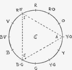
Figure 47. - The triangle AEI, rotating on C as a center, indicates typical triads or trichromatic harmonies.
The delicate balance of colors in area, tone and intensity, perplexing enough when only two important hues are employed, becomes very much more perplexing in the case of three important hues. Certain color theorists of the last century worked out formulas designed to guide the decorator in the quantitative distribution of color areas; but these formulas are so clumsy and inadequate, and so subject in practice to a thousand modifications and derogations, that it is far safer to ignore them altogether. Indeed, it is far safer for the beginner to let the triads alone until through study and experience he has acquired the sure feeling for color which makes all rules for dealing with it merely a hindrance.
Besides their theoretical complexity, triad schemes are in practice hard to execute by reason of the difficulty of finding decorative materials in which the colors are properly distributed. In fact this is often impossible unless the time and money available permit having things specially designed and made to order. In the case of our chosen dominant hue, for example, a triad scheme would employ yellow-orange, blue-green and red-violet. Since two of these hues are cold, the triad would probably be disagreeable in low tones. Therefore, in doing a room - say a sitting room or boudoir - the decorator, in order to make the cold colors light enough to be agreeable, would break all the colors with light gray, which would give him a light grayish tan, sage green, and lavender. Executed in the best things to be found ready-made in the shops, these colors would be likely to result in a somewhat stiff and unsympathetic arrangement of grayish tan walls, sage green plain carpet, lavender on some of the furniture, repeated in pictures, ceramics, cushions, or lamps, and a mixture of lavender, green and grayish tan in printed linen hangings and slip covers for some of the furniture. To achieve anything like a subtle harmony he would have to wait several months and pay roundly for a special rug containing the three colors properly distributed, while fringes and gimps would have to be specially made, lamp bases and picture frames specially toned, and a screen or a decorative panel for the over-mantle specially painted.
Continue to:
My Books

