Color Harmony. Part 4
Description
This section is from the book "The Principles Of Interior Decoration", by Bernard C. Jakway. Also available from Amazon: The Principles of Interior Decoration.
Color Harmony. Part 4
Red, blue and yellow do not present the same difficulties, because of the great range of rugs and drapery stuffs containing those hues in the lower values, as well as the range of fabrics containing rose, cream and azure in the high values. Even here, however, the difficulties are considerable. Both analogous and complementary harmonies may under suitable conditions be widened by accents to include a wide gamut of colors, and therefore to meet practically every color requirement.
Having chosen the hues to be used in a given room, the decorator must determine the areas upon which each hue is to appear. It is clear that no formulas of constant value can be adduced to cover these distributions, since the effect of a color will depend far more upon its purity than upon the superficial area it covers. Indeed, there is but one rule which can never be disregarded, namely, that the mind must not be left in any perplexity as to the dominant hue. For example, in a room with light golden brown walls, tan ceiling, brown furniture, and olive rug, hangings and furniture coverings, there is a chance for perplexity as to which color is dominant, and such perplexity would mean a lack of unity and therefore of beauty in the room. Here the decorator will first of all see to it that the yellow element in both hues is clearly apparent. If this seems insufficient, olive and brown furniture coverings, or olive and gold hangings, or both, may be substituted for the plain olive. In other words, by some method or other the dominant hue must be made clearly apparent to the mind.
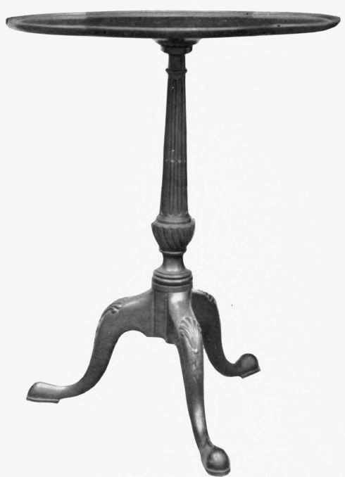
Plate XII. - Small occasional tables are not only necessary in grouping furniture for convenient use, but they also serve to relieve a room of the effect of heaviness due to exclusive use of large pieces, and to give it a note of gaiety and animation. The table shown above is an example of fine proportion and of perfect adjustment of ornament to structure.
Courtesy of Gill & Reigate Ltd., London.
In triad schemes the two secondary hues may be distributed pretty much according to personal fancy. These two colors should, however, be so distributed that the total effect of one, as determined both by area and intensity, is perceptibly greater than that of the other.
In complementary harmonies the general rule of practice is to increase the relative area of the dominant hue as the purity of the wall color is increased. In a yellow and violet room, for example, when the walls are of an almost neutral yellowish-gray the quantities of yellow and violet used in the other surfaces of the room would be as nearly as practicable equal; assuming, for the purposes of this illustration, that these colors were employed in equal intensity. With yellow walls of one-fourth intensity the other areas would contain about twice as much yellow as violet, and with yellow walls of one-half intensity about three times as much yellow as violet. With yellow and violet of unequal intensity the relative areas would be altered to allow for the differences. The method, of course, applies, roughly, to all pairs of complementaries. It is illustrated graphically in Figure 48, in which the upper section of each oblong represents the wall area and the lower sections all the other colored areas.

Figure 48. - In complementary schemes the area of the dominant hue, other things being equal, is increased directly with the purity of the wall color.
The distribution of colors as to their luminosity, apart from the nature of the hues, is of the greatest importance in color practice, being, indeed, fundamental to all good work. The subject has however been discussed at such length as is permitted by the limitations of this study in the chapters on contrast and light and shade. It is reintroduced here merely in order to fix it in its proper position in the general subject of color harmony.
In intensity colors may vary from spectral purity to neutral gray. Spectrum colors are, as we have repeatedly noted, bold, aggressive, obvious and of pronounced individuality. In direct proportion to the degree in which their own positive qualities are overcome, or neutralized, by the equally positive antithetical qualities of their complementaries they become progressively quiet, subtle and refined. It is manifest that all background surfaces must be relatively neutral, both because the eye could not stand constant exposure to large areas of positive color, and because it is the proper function of a background to stay back - to provide an effective foil for the clearer outlines and brighter colors of the objects or the persons who appear against it. A delicate picture or complexion against a pure red or green or yellow background would be like a lullaby sung to the accompaniment of a calliope.
The wall color may be anything from half-intensity to a gray just tinged with the hue. Other things being equal, purity of the wall color will vary inversely with the number and purity of the other hues in the room. No washed-out, characterless, colorless room is pleasant to live in. Every room requires a certain amount of color interest and of positive color quality, although the amount will vary according to the purpose and size of the room and the tastes of its occupants. When there are few hues in the rugs, hangings, furniture and decorative objects employed in a given room, and these few hues relatively neutral in character, the walls ought normally to approach the maximum of one-half intensity in order to invest the room, as a unit, with the necessary color interest. For example, yellow used on the walls of a Craftsman living room furnished in dull colors and having only a few low-toned pictures, vases and books for accents could be anywhere from one-fourth to one-half intensity; whereas in a drawing room furnished with a Kermanshah rug, bright-colored paintings, rich porcelains, lacquered cabinets, and satinwood chairs and settees upholstered in brocades or damasks the hue would be neutralized to a point where it would just appear in the warm grayish-cream walls.
Continue to:
My Books

