Proportion. Part 8
Description
This section is from the book "The Principles Of Interior Decoration", by Bernard C. Jakway. Also available from Amazon: The Principles of Interior Decoration.
Proportion. Part 8
The ceiling must seem to the mind to have some body and weight, since in the modern house it is to be regarded not as the sky above the room but rather as its roof. The very common practice of making the ceiling perfectly smooth and of doing it in white or pale cream regardless alike of its actual height and of the coloring and tone of the walls often results not only in sharp tone contrasts by which the mind is more or less consciously perturbed, but also in the loss of the sense of sheltered intimacy. Making the ceiling slightly rougher - for example, by covering it with cloth and painting it in oil and stippling - and keeping it a little lower in tone, according to a formula to be stated in the chapter on light and shade, makes it seem heavier and therefore more satisfactory to the mind, while at the same time it pr events an inartistic contact with the walls.
Whatever its tone, the ceiling must seem to be adequately supported. This requires the use of a supporting molding of some kind at the point where the ceiling appears to rest on the sidewalk The position, depth, projection and ornamental character of this member will naturally depend upon the proportions of the room and upon its function and decorative motive, and it ought in every case to be determined by a competent architectural designer. In any case the cornice molding must appear in its turn to be adequately supported. Nothing is more disturbing, and few things more commonly experienced, than the consciousness of a cornice which seems heavy enough amply to support the ceiling, but is itself quite unsupported and apparently suspended in the air.
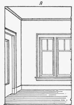

Figure 35. - Note the effect of structural adequacy produced by the addition of the cornice (B). The effect would be still more satisfactory as the result of an increase in the height and projection of the base-board.
Where the walls are paneled the ceiling support is of course adequate, as it is where over-mantel and over-doors are extended to the cornice, following the general practice in rooms of importance. In ordinary rooms this apparent support will be afforded either by the walls or by the openings, or by both. The mind unconsciously regards the wall of a room as an order, or combination of architectural factors necessary to hold up the solids over an opening, and it demands either that the wall itself seem to possess the strength essential to this office or that it be performed by the openings. In the latter case the windows set off by their draperies seem to act as columns which support the cornice and ceiling. Here the impression of strength conveyed by the pillars of classic architecture is expressed by the draperies, which must, of course, fall to the floor; and the deeper the folds of the fabric the more marked will be the shadows they cast and the greater the impression of strength.


Figure 36. - A heavy cornice causes plain walls to appear weak and inadequate. Note also the effect of weakness due to the very low base-board, and the unpleasant effect of dividing the wall improperly in the placement of windows.
Where the walls are depended upon for apparent support for the cornice and ceiling they must be strengthened by relatively dark color or marked texture or pattern, or by two or three of these factors in combination. In this case the hangings do not require to be hung to the floor. They may, if desired, be made of light textures and stopped at the bottom of the apron; but they must be definitely related either to the walls or to the windows. The common practice of stopping them arbitrarily at a point nine or twelve or fifteen inches below the sill ignores their structural character and leaves the mind perturbed and unconvinced.
The present vogue of plain walls has much to recommend it; yet it often results in bad decoration because, like every other vogue, it often disregards considerations of fitness. The predominance of plain as opposed to ornamented surfaces results naturally in effects that are fine and delicate, but that easily become thin and poor when overemphasized; while the predominance of ornamented as opposed to plain surfaces makes for a breadth and richness of effect that easily develops when overemphasized into complexity and confusion. It is therefore clear that plain walls, set off by hangings, furniture and objects of art, accord excellently with relatively small rooms and relatively light coloring; but that when the rooms are large, the colors low, and the requirements of structural emphasis pronounced, plain walls lack the strength to support the cornice and ceiling unless they are either paneled or invested with a marked effect of rough or open texture, whether through the use of plaster, paper or cloth. In every case where there is any room for doubt as to its structural adequacy a texture paper should be tried in position before it is chosen, since it will often be found that nothing less than pattern, of a size and emphasis proportioned to the scale of the room, will prove adequate for its structural requirements.
The preference for plain walls, as for plain rugs and plain hangings, is largely based upon the belief that they are more restful than figured walls, make a more sympathetic background for the other decorations, and cause the room to appear larger. This belief is only partially warranted. In the degree that plain walls are smooth and shiny they are unrestful and unsympathetic. In the degree that either walls or floor coverings are in sharp contrast in hue, tone or texture with the objects that appear against them, they tend to reduce the apparent size of the room. Moreover, it is to be remembered that furniture of ugly or eccentric outline is emphasized and thrown into an unwelcome relief by plain walls, and reduced to relative impotence by repeating but inconspicuous pattern; and, finally, that in the degree that the room is filled with furniture of many styles, its unity must be emphasized in every practicable manner. As we have seen, the simplest way to emphasize the unity of a room is to cover its background surfaces with a repeating pattern.
Proportion as it affects the distribution of tones, hues and ornament will be discussed in later chapters. No discussion of any phase of the subject can, however, be more than helpfully suggestive. An accurate sense of proportion demands that certain powers of perception and comparison be strengthened, and they can no more be strengthened by reading about proportion than the body can be strengthened by reading about the Petersen exercises or the Swoboda system. The eye and the mind must be trained by long observation and study of beautiful forms in nature and in art to perceive the subtle spatial relationships, hidden utterly from the untrained eye, upon which beauty and significance, in decoration as in all the arts, so largely depend.
Continue to:
My Books

