Papering And Painting The House
Description
This section is from the book "Warne's Model Housekeeper", by Ross Murray. See also: Larousse Gastronomique.
Papering And Painting The House
Papering a house is a subject for great consideration before furnishing it. Very generally the landlord of a dwelling-house allows the incoming tenant to select his own papers at a fixed price. If the tenant wishes for a more expensive paper he can have it, of course, by paying the extra expense.
In selecting the paper-hangings, judgment and taste are necessary.
We should always recollect that wall papers are the same (or ought to be) as the background to a picture. They should not therefore be such as will attract attention to themselves especially; they should be subdued in effect, with no strong contrasts of colour, or of shades of dark and light. Nothing should disturb the sense of flatness on the wall. The tints should be simple, the objects represented on it should be conventionally flat.
While the decorative details should be arranged on symmetrical bases, these should be so resolved into the minor forms as not to be obtrusive. Prominent colours should be broken over the whole surface, so as to give a general negative hue. There should be no masses of prominent colour.
If the householder already possesses furniture, regard must be had in selecting the papers, to the harmony of their colours and style with those of his furniture, carpets, and curtains.
The effect of colour in producing beauty is not half understood by people in general. An apartment in which the harmony of colour is perfect, although the furniture in other respects may be of very moderate goodness, will far surpass in effect a gorgeously or handsomely furnished room in which the effect of the mighty enchanter COLOUR has been set at nought. A right blending or harmonizing of hues, or judicious contrasts, can only be attained, however, by some artistic knowledge, or by that instinctive taste possessed by some persons. A few words on colour may not be unwelcome to our readers, while on this subject.
There are generally said to be three primary colours - red, blue, and yellow. Any two of these mixed will form a secondary colour; for example, red and yellow combined give orange; yellow and blue, green; blue and red make purple. Each primary colour has its complementary colour in the other two mixed together. Thus, for the primary RED, yellow and blue combined furnish the complementary colour green; in blue and red, which produce purple, we have the complementary of yellow. In the union of red and yellow making orange colour, we have the complementary of blue. Of course it is clear that the complementary colour of the secondary or mixed colours must be the primaries themselves.
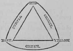
PRIMARY.
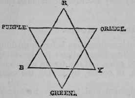
PRIMARY AND SECONDARY COLOURS.
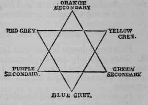
SECONDARY AND TERTIARY COLOURS.
In practice, therefore, we are sure of harmony of tint between blue and orange, purple and yellow, green and red.
The secondary colours form by their union the tertiary colours, which are greys - sometimes distinguished as russet - citrine, and olive. These also have their complementary colours; a red grey will be complementary to a green, a blue grey to an orange, a yellow grey to purple.
Colours are modified by mutual neighbourhood, some becoming dulled, some more resplendent by the reaction on themselves of the colours next to which they are seen. This fact was long known, but the law which controlled them was discovered by M. Chevreul, director of the Gobelins tapestry manufactory.
He asserted that the phenomena of colour contrast fell under two classes - the contrast of colours simultaneously seen, and the successive contrast of colours seen one after the other in time. It is to the former class that the most important questions regarding domestic art belong, and the law which governs this class of contrasts is simply this - that when the eye sees at the same time two colours which are in near neigh-boicrhood, they will appear as dissimilar as possible.
Chevreul asserts that there are six distinct modes in which colour harmony may address itself to our minds, and that these may be classed under two heads - the harmony of analogous colours, and the harmony of contrasts. Under the harmonies of analogy he classes.
Continue to:
My Books

