Colour With Reference To Light. Continued
Description
This section is from the book "Principles Of Home Decoration With Practical Examples", by Candace Wheeler. Also available from Amazon: Principles of Home Decoration.
Colour With Reference To Light. Continued
If colours which we like have a soothing effect upon us, those which we do not like are, on the other hand, an unwelcome influence. If a woman says in her heart, I hate green, or red, or I dislike any one colour, and then is obliged to live in its neighbourhood, she will find herself dwelling with an enemy. We all know that there are colours of which a little is enjoyable when a mass would be unendurable. Predominant scarlet would be like close companionship with a brass band, but a note of scarlet is one of the most valuable of sensations. The gray compounded of black and white would be a wet blanket to all bubble of wit or spring of fancy, but the shadows of rose colour are gray, pink-tinted it is true; indeed the shadow of pink used to be known by the name of ashes of roses, I remember seeing once in Paris - that home of bad general decoration - a room in royal purples; purple velvet on walls, furniture, and hangings. One golden Rembrandt in the middle of a long wall, and a great expanse of ochre-coloured par-quetted floor were all that saved it from the suggestion of a royal tomb. As it was, I left the apartment with a feeling of treading softly as when we pass through a door hung with crape. Vagaries of this kind are remediable when they occur in cravats, or bonnets, or gloves - but a room in the wrong colour! Saints and the angels preserve us!
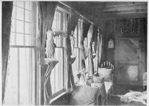
SITTING-ROOM IN "WILD WOOD." ONTEORA (BELONGING TO MISS LUISITA LEI.AND).
The number, size, and placing of the windows will greatly affect the intensity of colour to be used. It must always be remembered that any interior is dark as compared with out-of-doors, and that in the lightest room there will be dark corners or spaces where the colour chosen as chief tint will seem much darker than it really is. A paper or textile chosen in a good light will look several shades darker when placed in large unbroken masses or spaces upon the wall, and a fully furnished room will generally be much darker when completed than might be expected in planning it. For this reason, in choosing a favourite tint, it is better on many accounts to choose it in as light a shade as one finds agreeable. It can be repeated in stronger tones in furniture or in small and unimportant furnishings of the room, but the wall tone should never be deeper than medium in strength, at the risk of having all the light absorbed by the colour, and of losing a sense of atmosphere in the room. There is another reason for this, which is that many colours are agreeable, even to their lovers, only in light tones. The moment they get below medium they become insistent, and make themselves of too much importance. In truth colour has qualities which are almost personal, and is well worth studying in all its peculiarities, because of its power to affect our happiness.
The principles of proper use of colour in house interiors are not difficult to master. It is unthinking, un-reflective action which makes so many unrestful interiors of homes. The creator of a home should consider, in the first place, that it is a matter as important as climate, and as difficult to get away from, and that the first shades of colour used in a room upon walls or ceiling, must govern everything else that enters in the way of furnishing; that the colour of walls prescribes that which must be used in floors, curtains, and furniture. Not that these must necessarily be of the same tint as walls, but that wall-tints must govern the choice.
All this makes it necessary to take first steps carefully, to select for each room the colour which will best suit the taste, feeling, or bias of the occupant, always considering the exposure of the room and the use of it.
After the relation of colour to light is established - with personal preferences duly taken into account - the next law is that of gradation. The strongest, and generally the purest, tones of colour belong naturally at the base, and the floor of a room means the base upon which the scheme of decoration is to be built.
The carpet, or floor covering, should carry the strongest tones. If a single tint is to be used, the walls must take the next gradation, and the ceiling the last. These gradations must be far enough removed from each other in depth of tone to be quite apparent, but not to lose their relation. The connecting grades may appear in furniture covering and draperies, thus giving different values in the same tone, the relation between them being perfectly apparent. These three masses of related colour are the groundwork upon which one can play infinite variations, and is really the same law upon which a picture is composed. There are foreground, middle-distance, and sky - and in a properly coloured room, the floors, walls, and ceiling bear the same relation to each other as the grades of colour in a picture, or in a landscape.
Fortunately we keep to this law almost by instinct, and yet I have seen a white-carpeted floor in a room with a painted ceiling of considerable depth of colour. Imagine the effect where this rule of gradation or ascending scale is reversed. A tinted floor of cream colour, or even white, and a ceiling as deep in colour as a landscape. One feels as if they themselves were reversed, and standing upon their heads. Certainly if we ignore this law we lose our sense of base or foundation, and although we may not know exactly why, we shall miss the restfulness of a properly constructed scheme of decoration.
The rule of gradation includes also that of massing of colour. In all simple treatment of interiors, whatever colour is chosen should be allowed space enough to establish its influence, broadly and freely, and here again we get a lesson from nature in the massing of colour. It should not be broken into patches and neutralised by divisions, but used in large enough spaces to dominate, or bring into itself or its own influence all that is placed in the room. If this rule is disregarded every piece of furniture unrelated to the whole becomes a spot, it has no real connection with the room, and the room itself, instead of a harmonious and delightful influence, akin to that of a sun-flushed dawn or a sunset sky, is like a picture where there is no composition, or a book where incident is jumbled together without relation to the story. In short, placing of colour in large uniform masses used in gradation is the groundwork of all artistic effect in interiors. As I have said, it is the same rule that governs pictures, the general tone may be green or blue, or a division of each, but to be a perfect and harmonious view, every detail must relate to one or both of these tints.
In formulating thus far the rules for use of colour in rooms, we have touched upon three principles which are. equally binding in interiors, whether of a cottage or a palace; the first is that of colour in relation to light, the second of colour in gradation, and the third of colour in masses.
A house in which walls and ceilings are simply well coloured or covered, has advanced very far toward the home which is the rightful endowment of every human being. The variations of treatment, which pertain to more costly houses, the application of design in borders and frieze spaces, walls, wainscots, and ceilings, are details which will probably call for artistic advice and professional knowledge, since in these things it is easy to err in misapplied decoration. The advance from perfect simplicity to selected and beautiful ornament marks not only the degree of cost but of knowledge which it is in the power of the house-owner to command. The elaboration which is the privilege of more liberal means and the use of artistic experience in decoration on a larger scale.
The smaller house shares in the advantage of beautiful colour, correct principles, and appropriate treatment equally with the more costly. The variations do not falsify principles.
Continue to:
My Books

