Harmonies Of Likeness And Contrast In Colour
Description
This section is from the book "The Practical Book Of Furnishing The Small House And Apartment", by Edward Stratton Holloway. Also available from Amazon: The Practical Book Of Furnishing The Small House & Apartment.
Harmonies Of Likeness And Contrast In Colour
What is harmony? We frequently hear those speaking of friends say: "They are so congenial because they have so much in common," or else: "Although they are so different they get along well together - one seems to supply what the other lacks".
Well, in colour, then, we have the same two kinds of harmony - that of likeness and that of contrast. As this book is intended to be an actual guide, the treatment of these will be made much fuller and more practical than usual.
The three primary colours * - yellow, red and blue - possess qualities which seem to have escaped the observation of former writers until indicated by the present one in "The Practical Book of Interior Decoration." Yellow is an especially "harmonising" colour. If chrysanthemums of various growths ranging all the way from a slightly greenish tone of yellow to an orange-yellow be placed together in a vase no great discord will be felt. Certain varying hues of red go well together, but the range is not nearly so extensive as it is with yellow; while blue is a particularly sensitive colour. We shall not be long in discovering the practical value of this observation.
Harmonies Of Likeness
In the congeniality of friends we found first the harmony of those who naturally differ from each other but where that difference is united by some quality in common. So also we find tones and tints unified by a common component. Let us begin with yellow.
If we modify yellow by adding white, black, or red, or all of them, in different degrees, we secure the creams, yellowgreys, orange-greys, buffs, tans, apricot, yellow-orange, orange, and browns. The furnisher of the home using almost any of these together will find that the tones selected will harmonise.
*As we are dealing with material dyes and pigments it is useless to consider here the Helmholtz theory, which has to do with light only.
Now let us modify yellow with the remaining primary colour, blue, and white or black. We then have yellow-white and greenish whites, greys varying from yellowish to greenish, and tones of green such as apple-green and the olives. All the hues of bright green are composed of yellow and blue without other admixture.
We found that orange agreed well with all the quieter modifications of yellow, although orange is not only a combination of the full strength of yellow and red but is also one of the most advancing hues in the whole gamut of colour. But we do not find that the strongest combination of yellow with blue, brilliant green, will properly accompany such a modification as olive. Why is this? Evidently not because of difference in intensity, for that does not affect orange in its relations to quieter tones and tints, but because of the sensitiveness of the blue which enters into the combination. Yellow and red are warm colours and blue is cool. Yellow is a strong harmoniser, red is less so, and blue is defective in this respect. What result do we get from these qualities? Practically all of the greens and green tones in this group agree with the yellow tones in the group above because of the strong presence of yellow in both, but when red enters largely into the modifications in the first list we find it to have an alienating quality against those tones in the second list that are cold - warm tans and browns do not, for example, well accompany cold greenish greys in which there is little yellow. Orange and green agree.
Red is next in order: and it cannot too often be insisted upon that normal red is not the vermilion hue but is quite crimson in tone. When normal red is modified with white and a little black we secure the various beautiful shades of rose. If a little yellow is added we get yellowish rose. If yellow is combined with red we have all the brilliant shades of orange-red to, again, orange, because that is a mixture of equal strengths of normal red and normal yellow. White and black added to the above combinations result in the quieter tones and tints of these - such as old rose, ashes of rose, salmon, red-brown, terra-cotta, brick red and the series of pinkish to orange greys.
It has been said that red is not a particularly effective harmoniser, and we shall quickly be able to verify this by placing brick red and rose together. All the tones of rose (normal red modified by black and white) accompany each other well and all the tones of red modified by yellow, white and black similarly harmonise, but members of the two groups do not. Where they rather closely approach each other they may be used in different parts of the same room, because at a distance the difference would not be so great as to be noticed. Here, too, we arrive at the principle that neutral tones have a harmonising effect. Hues which might not particularly well accompany each other in immediate contact will often not clash if separated by an expanse of white, black, grey or fawn. This principle was not introduced till the need for it occurred, but it is very valuable in household furnishing.
To recur to the disagreement of certain reds we shall see that this is of practical moment in the selection of textiles to be used in rooms containing brick fireplaces or red tiles. We evidently should not accompany these by the crimson or rose reds, but by those of brickish tone that contain some yellow.
In certain of these combinations of red with yellow, white, and black there is a "muddiness", and the ugly shades of red will be found in this class. They should naturally be avoided. Terra-cotta is in itself not an entrancing colour and not a particularly easy one to harmonise with other hues.
The second possible modification of red is by the use of blue, white, and black - any or all of these. This results in normal violet and the dusky and red violets, the mauves and the plums, all the violet-greys and violet-whites. There is not much disagreement between any of these, but when we attempt to use them in immediate proximity to the reds modified by yellow we shall have to go cautiously. The rose-reds go well with the violets because of the common presence of red. When a little yellow, white and black enters into the composition, the resulting brick red clashes with the violets - mauve and brick red are distressing. Where much yellow is used with the red we have orange and its tones, and these agree with the violets by opposition and will be treated in the next section.
When blue is modified by yellow, white, and black we get all the tones and tints of greenish blue. The great sensitiveness (if blue was noted, and one has only to try different tones together to realise it. Normal blue does not agree cither with greenish blue or reddish blue, and these last two violently clash while they still retain a large proportion of blue. As they reach the outside limits of the scale they become green and violet and agree by opposition. About the only shades of real blue which agree together are the lighter and darker tones of the same hue.
The Tertiary colours - citron, slate, and russet, which contain certain portions of all three primary colours - harmonise by likeness or contrast according to their main component. Citron, for example, is a tone of tan and contains more yellow than it does red or blue: consequently it possesses the same harmonising qualities as the other yellow derivations.
Harmonies Of Contrast
To each colour there is another opposing it and which with it affords a harmony by contrast: these are therefore termed Complementary Colours. Arranging the hues in their sequence (see Diagram 1) we shall at once see the complementary of each by following the dotted line across the diagram. It will be noted that each of these contains none of the other: for example, red is the complementary of green; green is composed of yellow and blue and contains no red.
But - we frequently find such colour-schemes advised as yellow and blue. This is a very attractive combination and is opposing because neither colour contains any of the other. They are not, however, complementary: the complement of blue is orange, which is composed of yellow with red, and the red is here lacking. One would think this a sufficiently strong hint, yet one writer on decoration will intimate that there should be some blue in every room, and another will mention the enlivening effect of red or the sunny quality of yellow without arriving at what needs to be said. This is that for the eye to be fully satisfied some quantity of all the primary colours must be present.
No matter how beautiful a room furnished in yellow and blue may be it will never be so entirely pleasing as if a few touches of red were introduced into it. This, naturally, does not mean that we should fill every room with raw yellow, blue, and red: the tones of yellow and blue likely to be employed in the original scheme would likely be buff or old gold with a blue somewhat greyed: hence they should be accompanied or supplemented by a modified red, such as rose, yellowish rose, or dull red.
Let us therefore term such hues Supplementary Colours.
The writer will arrange the colours in sequence in another diagram (No. 2).
Imagine this to be a watch face, with three hands, pointing to yellow, red and blue - the first supplementary harmony. Now if we moved each hand forward one space they would be in the position occupied by the lines composed of long dashes and would point to yellow-green, blue-violet, and red-orange. Another move (to the dotted lines) gives us green, violet and orange, and still another (to the lines of dot and dash) shows blue-green, red-violet and yellow-orange. If we employ two hues of any set we should, in order to secure the fullest and most satisfying use of colour, supplement these by small portions of the third. As before, this extends to the tones of these hues as well as to the strong colours themselves.
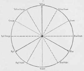
Diagram 2. - Triads of Colour.
We shall notice that where we employ the complementary of mixed hues, such as orange, violet and green, we are in effect using supplementaries also. If we place in the same room yellow and violet we are really employing yellow, red, and blue because the violet is composed of the latter two.
Two out of any three supplementary colours go well together, but the lack of the third will be felt. We have seen this to be the case with yellow and blue, and it will be equally plain with any other triad. Let us try yellow-green and blue-violet: both of these contain blue, the first contains a quantity of yellow and the second a small portion of red. To complete these a little more yellow is needed and a good deal of red: combine these two needs and we have the colour red-orange as supplementary to yellow-green and blue-violet.
Continue to:
My Books

