Part I. Colour And Form. Chapter I. The Practical Use Of Colour
Description
This section is from the book "The Practical Book Of Furnishing The Small House And Apartment", by Edward Stratton Holloway. Also available from Amazon: The Practical Book Of Furnishing The Small House & Apartment.
Part I. Colour And Form. Chapter I. The Practical Use Of Colour
Beauty; that's colour and proportion.
John Donne, "An Anatomy of the World"
Colour As A Reality
AS all objects possess colour it is not possible to proceed with the purchase or use of furnishings or to plan the interior desired without first giving consideration to this quality.
On the one hand colour is not, for practical uses, nearly so abstruse and difficult a subject as many imagine, and, on the other, the general "good taste" which most persons feel they possess is not of itself and without knowledge of the qualities of colour sufficient for its effective management.
It will here be treated in its direct relation to the problem of furnishing the small house or apartment, and that treatment will be made useful, full and simple.
The qualities of colour are not fanciful; they are real, and may be dealt with accurately. Just as inevitably as in mathematics two and two make four, just so surely does the admixture of yellow and blue create green. Just as certainly as day means light and night darkness, so certainly does yellow increase the appearance of light in a room and does deep violet lessen it.
In the right use of colour both harmony and relief should together find their place. Harmony gives us restful-ness and repose, but if carried throughout an abode we feel a lack of stimulus and interest. That interest is supplied by contrast, but if this be carried to excess it results in disturbance. Both should therefore exist in proper measure, and that measure depends somewhat upon the temperaments of the occupants: as has been said, some are very quiet and others more colourful in their tastes.
To secure this peacefulness with interest in our homes we need to know the qualities of colour.
We are all accustomed to speak of quiet colours and those that are brighter, of things which are light and those which are dark, and of colours which "go together" and those that do not. Let us look into these three matters in their order.
Intensity In Colour
The bright colours are those in their purity - what is called their normal hue - and these are the "primaries," normal yellow, red and blue, and the "secondaries," orange (yellow and red) green (yellow and blue) and violet (blue and red). Now, of these six "bright" colours, yellow, orange, and red are brighter and stand out more forcibly than the others, and hence they are termed advancing colours. They are also warmer in tone than the other three. Of the latter, blue and green are retiring and cool, while violet is neutral.
But, while some of these are stronger than others, all have their brightness in these normal hues and consequently when they are employed in furnishing they are commonly used in small quantities.
The colours of lesser intensity are composed by the admixture of other colours, or black or white, or some of each, with these. For convenience, these colours of lesser intensity will throughout be referred to as Tones, (degrees of intensity are technically called chroma). We all recognise these modified hues under the names of rose, buff, grey-blue, apple-green, olive-green, slate, citron, and the like, and they are generally found more agreeable as constant companions in our dwellings than the pure colours.

PLATE 8. A DINING-ROOM IN MODERN STYLE.
DESIGNED BY SHIRLEY B. WAINWRIGHT, INTERIOR ARCHITECT, LONDON.
A variety of colour in middle intensiy and tint.
Still lighter and quieter are the Tints, composed largely of white with but a small admixture of colour and often some black (black and white, properly speaking, are not colours). These are the greys, fawns, creams, etc. Where clear in tone they are very beautiful, and, owing to their quietness, are suitable for use in large quantity.
Shades are hues darker than normal - i.e., they contain some blackness.
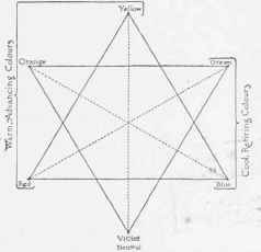
Diagram 1. - The Six Primary and Secondary Colours Complementaries shown by following the dotted lines.
We have already arrived at the means of securing one sort of harmony and contrast - that afforded by the quality of intensity in colour. It is plain that if in a room we use tones which do not greatly differ in their strength we shall have harmony in this respect, and that if we then add in smaller quantity one or more brighter and stronger hues we shall have gained relief in addition to that harmony.
We can see the practical working of this by taking as an example one of the most manageable methods of furnishing.
The largest surfaces are walls, ceilings and floors. The walls might be in a tint of warm grey, the ceiling a little lighter, and the rug of darker grey or taupe, or we might employ cream for the former and lay down a rug of tan: either would be excellent, but so far there would be little interest. This must be given by the use of stronger colour and it would be introduced in the textiles and other furnishings.
"Scale" In Colour
A principle is often made clear by its violation. Suppose a room entirely furnished in soft colouring, with light tinted walls and delicate tones in the rugs and covering of the furniture: into this room of great (and perhaps anæmic) refinement bring a vase or cushion of the rankest red. The result need not be described - anyone can see that this added object is utterly inappropriate and that taste has been violated.
Scale in colour is a proper degree of correspondence in the intensity of the various colours used. As we have seen, some may be, and should be, stronger than others, but these should not be so much stronger as to "clash." If on entering a room any object "jumps" at one we may be sure it is "out of scale".
The general effect of the furnishings of a room may be very soft in colouring by reason of the weakness of the tones used, or harmonious with greater character because a stronger degree of colour is employed, or it may be decidedly lively because of the amount of bright colour introduced into it. In any case the degree employed is the "key" of the room.
Value
This is so intimately connected with scale that it is well to mention it here. Value is the degree of lightness or darkness in a coloured object irrespective of its hue. Entirely forgetting colour for the moment we shall realise that if we place together two pieces of drapery, the one yellow and the other violet, the first is light and the second dark.
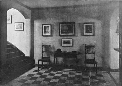
PLATE 9. AN IDEAL FORMAL HALL WITH SPANISH AND ITALIAN SEVENTEENTH CENTURY FURNITURE.
Light "value" in the floor and picture-mats; dark value in floor, pictures, and furniture.
Richard A. Fisher, Architect.
Here also we may have harmony and relief. As colour-scale is a proper correspondence in intensity of the colours used, so right value is a proper correspondence in their degrees of lightness and darkness. Harmony is likewise given by a considerable uniformity in this respect, and relief by the use of some objects either lighter or darker than the general effect but, again, not so different as to startle and offend.
Such a room as the one mentioned, in which tints and delicate colour are used, is light. If tones of moderate strength are employed, the general effect is of medium value; while if the shades are chosen (colours deeper than normal) the value is dark.
As we shall see, various degrees of intensity and of value were used during the different epochs and were characteristic of the period styles: both qualities are of the utmost importance in furnishing to-day. Such light, bright colours as baby-pink and baby-blue are fit only for the nursery. The young girl's room should be maidenly but not weak. Extremely refined and attenuated colour is often chosen by those whose culture has lost power and strength: greater frankness of tone in environment might aid them in regaining these. Men of "settled" character are apt to choose furnishings dark and sombre: more geniality in their surroundings might not be amiss in effect.
As the happiest atmosphere for the abode of limited dimensions is that of charm and cheerfulness, a good degree of lightness and a considerable amount of colour will be found most generally appropriate and agreeable.
We must sensibly realise that in a world of people of such varying types and desires, we shall naturally find a considerable variation not only in the general amount of colour preferred but also in the likings of different persons for certain hues. Much of this is due to the lack of use of this particular sense and a want of education in this respect. Where a sense is not cultivated we cannot expect to find much appreciation of it or much discrimination in its use. Outside of actual colour-blindness there are probably many who are physically or otherwise deficient in the realm of colour - as there are others who have little facility in the fields of music, mathematics or languages. Among those possessing an educated colour-sense there is substantial agreement; so those who say they are "very plain in their tastes" are perfectly free to exercise that preference in their own menage or their dress, but should be exceedingly cautious how they criticise others as "artificial" or " foolish " when these simply have a greater love for and appreciation of beauty. The difference may possibly lie in their own deficiency.
A certain degree of variation because of different temperaments and manners of life is perfectly reasonable. We should expect, for instance, the apartment of a popular actress to be furnished with a very considerable degree of novelty and a liberal use of colour. All that we may ask is that taste should be employed in the use of both - it may be, and we should find that it usually is. One would hardly choose for his own young daughter an environment of the same description; and this perfectly illustrates the degrees which are appropriate and desirable.
Preferences regarding the use of certain colours should be viewed in the same way: even among the cultivated we find some differences, and as these are apparently intrinsic they should be allowed for. If a certain person of excellent general taste has no particular liking for the various shades of blue, for instance, there is no compulsion to the large use of those hues in his home when others will answer quite as well.
While we should be careful therefore how we "pontificate" in minor details, we should realise that colour is a quality to be scientifically employed.
Continue to:
My Books

