


The Mitered Picture-Frame. Part 2
Description
This section is from the book "Design and Construction in Wood", by William Noyes. Also available from Amazon: Design And Construction In Wood.
The Mitered Picture-Frame. Part 2
Fig. 65. The upper arrangement of spaces is good because it conforms to the proportions of the picture. The lower one is not good because the square frame is out of harmony with the long picture.
If the margins around a picture are widened uniformly on all sides, what was originally a pleasing rectangle will lose its good proportions, but they may be kept good by increasing the length of the mat more than its width, Fig. 65. It is a safe rule for the amateur never to place a picture elsewhere than in the vertical center of the mat, nor to place a horizontal picture in a vertical frame, as in Fig. 66. Such arrangements are in danger of appearing like affectations.
To secure harmonious color and value in the frame, the same tones and values that predominate in the picture may be repeated in the frame; for instance, for Maxfield Parish's Au umn, Fig. 67. The frame is finished in yellows matching the color in the picture. Or the harmony desired may be secured by the introduction of a strong contrast, as a blue mat for a picture predominating in orange. Or, for a contrast in values, for instance where grays are used as in photographs, a white mat with a black frame is effective. As to the width of a frame, it is difficult to make any rules that will definitely and easily solve all cases, but a few suggestions may be
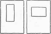
Fig. 66. These arrangements are likely to look like affectations.
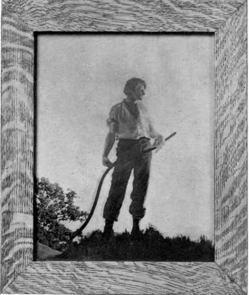
Fig. 67. Plain oak frame, stained a golden brown to harmonize with the predominant yellow tone of the picture. Maxfield Parrish's "Autumn." found serviceable. The width of a frame and its value bear a close relation, in their effect on a picture, as follows:
- A wide frame finished dark is appropriate for a picture predominating in darks and massive in treatment, as in Fig. 68.
Or a wide frame finished light (Fig. 69) sets off well a picture light in value and broad in treatment, and so on, thru all the intermediate grades from very dark to very light.
A narrow frame finished very dark, looks well around a picture where darks are used sparingly and delicately, as in some Japanese prints. See Figs. 70, 71, 72.
So, in like manner, a narrow and very light frame would be used only for a picture in a very light key and of a very delicate treatment, as in Fig. 73, 1 and 3. Where a mat is part of the framing of a picture, the frame and mat may vary in tone and value, in such a way as will not only not interfere with the unity of the picture, but will still further enhance its beauty. It is often possible further to unify the picture and its frame by repeating in the frame some characteristic feature of the picture. J If severe straight lines and flat spaces predominate, these are easily reproduced in the plain unbroken surface of the frame. Sometimes the representation of carving in the picture can be repeated in the frame, or a certain treatment or pattern in the picture may be echoed by a suitable treatment of the frame. Often an appropriate beading or other molding may give the desired effect, see Fig. 74. Sometimes a touch of bright color, as that of the pirate's cap in Fig. 75, can be repeated with good effeet in a fine line in the frame. In a word, the frame must be consistent with the color, notan, and general character of the picture.
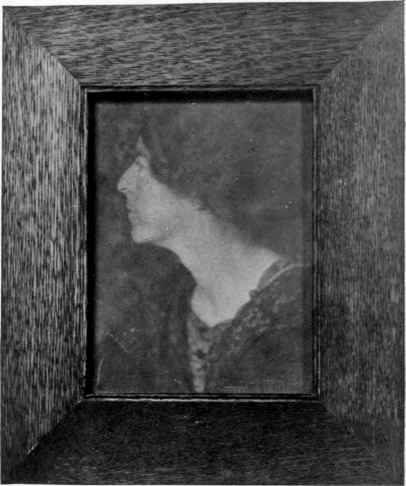
Fig. 68. Wide dark frame for a picture with broad dark masses; frame toned to dull brown of photo.
Continue to:


My Books

