


Sign Painting
Description
This section is from the book "Cyclopedia Of Painting", by George D. Armstrong. Also available from Amazon: Cyclopedia of Painting.
Sign Painting
Before giving some specimens of letters especially adapted for sign writing, it should be impressed on the sign-painter that all eccentricity in the forms of the letters is for the purpose quite out of place on inscriptions over a store or on a wall, and in the situations where his work is called into requisition, however much the purposes of posters and placards are supposed to be assisted there; in the latter case the object is to catch the eye of the passerby, in spite of the numerous other announcements by which each may be surrounded. The question in that case, becomes how to make one more striking than the other, and in this some of the placards succeed admirably. It is in fact impossible to speak too highly of the progress made in this respect by wood-letter cutters, some of whose works may truly be taken as models by the sign-painter. The test of beauty is fitness, and as the inscription of the name and trade of a storekeeper is not likely to be eclipsed by another inscription close to it, that the very architectural members serve as a separation, or, as it were, a framing, and that therefore no expedient is necessary to protect the words from being confused by the proximity or brilliancy of another inscription, but that simplicity, boldness and clearness are the great conditions to be fulfilled by the sign-painter.
The characters shown in Fig 65 have been called Sans-serif, Celtic and Grotesque, and are well adapted for situations when, owing to distance or other circumstances, fine lines and minute details would be out of place, or would diminish the boldness of the inscription. In Fig. 65 the character is given in its heaviest form, such as would be used high up on a wall, and where there is plenty of space at the disposal of the painter. This character does not admit of shadows or thickness, as it is in itself so solid that any addition to its form renders it clumsy.
For situations nearer the eye, Fig 66 is given, in which the letters are thinner and the general form more open. The form is thus rendered altogether more elegant and may be either used plain, or with thickness and shading. The letters require great care in outlining, so that all the lines may be kept of the same thickness, and that the same character may be preserved throughout.
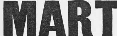
Fig. 65.
The character shown in the last example is well adapted for situations where the inscription is only of moderate length, compared with the space at the disposal of the painter. Fig. 67, however, shows how the letters given in Fig. 66 may be narrowed, or, as it is termed, elongated, so as to get a long inscription into a moderate space, and the sans-serif letter is better adapted than any other for this purpose, being, as it were, self-contained, that is, having no serifs or projecting' ends to take up space. The above is not by any means the narrowest letter of the kind, but will serve as an indication of the style.

Fig. 66.
Fig. 68 shows the character given in Fig. 67 in a lighter form, and is perhaps one of the most elegant letters of the kind. It may be used plain, or with the addition of thickness and shading.

Fig. 67.
In Fig 69 is given the Roman character, the most elegant of all those in use, and requiring the greatest care in outlining. It is not well fitted for distant situations, for as such a large proportion of the lines are fine, the whole of the letter does not strike the eye equally, nor is it, when the fine lines are properly rendered, well adapted for shading or for raising by means of thickness; it will, of course, be supposed that the whole letter would be made of the same thickness of wood, then the representation of this would, in the ease of the fine lines, be broader than the lines themselves, which would seem, as it were, the ed^es of the wood of which the letter is composed, instead of the surface.

Fig. 68.

Fig. 69.
As this character is often used for notices and other similar inscriptions, in Fig 70 is given a specimen of the lower case. Experienced sign-painters adopt two-thirds of the height of the capitals as the height of the small letters, and this is an admirable proportion. Any one who will take the trouble to look, will observe that wherever the capitals tower above the other letters in an undue proportion, the general forms and workmanship will indicate that the inscription is the handiwork of a second-rate artist. In types, the above character is called Canon, and in Fig. 71 examples are given of the character called Aldine, a very refined letter of a narrower character than the other; these are both adapted for situations where a rather long inscription has to be got in, but, although the last looks well in print, it is not adapted for letter painting, in which characters narrower than those in Fig. 69 should not be used.

Fig. 70.

Fig. 71.
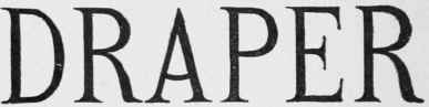
Fig. 72.
Fig. 72 is an example of a letter now very much used, under the name of Runic, but it would be difficult to defend the appellation, considering that it differs in every particular from the truly Runic characters, but in the multiplicity of letters it had become necessary to give some designation to this style, and on the principle that a rose by any other name would smell as sweet, the title by which this character is known has been bestowed upon it.
Continue to:


My Books

