The Dining-Room Furnishing
Description
This section is from the book "The Practical Book Of Furnishing The Small House And Apartment", by Edward Stratton Holloway. Also available from Amazon: The Practical Book Of Furnishing The Small House & Apartment.
The Dining-Room Furnishing
One of the finishes of the set already shown in Plate 45 is very dark with a handsome but restrained Japanese raised ornamentation. This may be employed, or the same set in walnut, or something else of similar nature.
With the first scheme we have blue hangings, and let us retain the black rugs for this room also. The furniture and rugs being dark, we may, for the chair seats, for instance, use the third heavy French cotton shown on Plate 46. The colouring here is rose-red, orange, blue, and yellow, but the tones are quiet and the combination rich and harmonious. The decorations of the buffet and mantel should carry out in plates, bowls, and candlesticks some of these tones. The screen could be a tawny-yellow or old gold. Some slight amount of neutralised green might appear among the accessories.
For the second-triad living-room plum hangings were provided, with grey furniture and sage green rug. For this room retain two of these and use the same furniture but in the soft grey with brown and white stripe. This will beautifully accord with the walls, hangings, and rug. The seats might be of the second stripe shown in Plate 46 - linen grey with narrow emerald green, black and orange stripes. This same material would make a very smart screen. Dull yellow or dull orange plates with candlesticks of amethyst glass or pottery and cream or white candles will complete a handsome interior.
Sometimes a second-triad scheme suggested here for a certain room may particularly appeal to the reader, so that he would like to use it, though for his general furnishing he prefers the first-triad combinations; or the reverse may be the case. Such substitutions may easily be made, for it is always to be remembered that the hues of the second triad are the secondary colours composed of mixtures of the primaries of the first triad - i.e. green = yellow + blue; orange = yellow + red, and violet = red + blue.
The strongest powers of all these hues together would frequently "fight", but their modified tones usually go amicably one with another. Enter the establishment of a decorator of the highest class and one will there find furniture of various descriptions with coverings, cushions and accessories of different hues: it is often but a collection of merchandise, not an interior laid out upon a colour-scheme, and yet there is little if any conflict, because the hues are more or less neutralised and not pure.
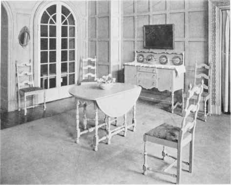
PLATE 45. DINING-ROOM OR BREAKFAST-ROOM SUITE IN WALNUT, IN ENAMELS, OR DECORATED.
Made for and Sold exclusively by John Wanamaker.


PLATE 46. FRENCH STRIPED HEAVY COTTONS IN GAY COLOURINGS.
Sold by A. L. Diament & Co., Philadelphia and New York.
50 inches wide. Half breadth shown.
Suppose then that the reader prefers the rose hawthorne scheme for the reception room, but would like to use the last described colouring for his dining-room - how shall he manage it?
He will have in the doorway the hanging belonging to the first scheme, which would continue the note of old blue into the dining-room. Plum would then be absent and if it is desired the hanging at the one door would require double-facing, plum being used on the dining-room side. This combination would need to be carefully chosen: we have seen in the section on Colour that tones different but not greatly different are apt to conflict, and that this is especially the case with blue and its combinations. A blue-plum might therefore not be found to answer, whereas one containing considerable red would agree - it would depend very much upon the particular tone of old blue employed.
The other features - sage green rug, grey furniture and striped material - should now be accompanied by some touches of rose and the old blue in order to unite the two rooms. This may easily be done by supplying accessories containing these colours.
Continue to:
My Books

