


Sign Painting. Part 3
Description
This section is from the book "Cyclopedia Of Painting", by George D. Armstrong. Also available from Amazon: Cyclopedia of Painting.
Sign Painting. Part 3
Fig. 82 is an example of Rustic character, well adapted for the name or inscription of a horticulturist or somewhat similar trade. In order to elevate the art, the sign-painter should be prepared to submit sketches of the inscription as a whole, and of individual letters drawn full size, and a well-selected set of patterns in a book will afford the customer an opportunity of examining the different characters before giving his order, and the sign-painter may be assured that this plan will be by far the most satisfactory one that could be adopted in the interests of all parties concerned. A word is given in Fig. 83 in the Elizabethan character.

Fig. 82.
which is perhaps the best adapted for business purposes. Church text is not well fitted for general inscriptions, as it is, of course, more or less associated with sacred things, and as it has varied from time to time a great amount of study is necessary in order to render it correctly.
In contrasting the Old English character with the German text, Fig 84, it will be observed that, whilst the former is essentially angular and severe, the latter is rounded and free. Thus, flourishes seem almost necessary to German text, whilst they are utterly out of place in Old English or Church text. They should always have some apparent connection with the letters themselves, and should not be used just to fill up a vacant space. A word or sentence is often too crowded at one part of the surface on which it is painted, leaving a blank space at the other, and this is usually filled up with a meaningless flourish. By the method already pointed out for spacing the letters, this ugly expedient is rendered unnecessary.

Fig. 83.
The Old English and German text do not look well when rendered with thickness. They are so essentially writing characters that fine lines are indispensable to them, and the beauty of these and the contrast of them with the thick lines are diminished when both are viewed from the side, and are seen to be equal in solidity, both characters, however, look well when outlined with a darker color than that in which they are painted, but in that case, more than ever, the absolute correctness of form must be insisted upon.

Fig. 84.
Italics, as in Fig 85, are not by any means the easiest characters with which the sign-painter has to deal, the main difficulty being the uniformity of slope. In the letter M, the right-hand down stroke, which in the Roman character would be upright, must take the slant of the general mass of letters.

Fig. 85.
The A and V afford subjects for some study and trial. They may either be drawn so that their down strokes slant like the other letters, or they may be outlined in a parallelogram, their point being in the middle of one of the sides. The X is necessarily drawn according to the latter method. Fig. 86 shows the small letters, or lower case, of the Italic character. It is as it were a substitute for plain writing, but no nourishes of any kind are admissible.
The words written in Italic small, must not be spread, in fact, the character looks much better when packed, or placed close together, the down strokes not being too thick. It is very important that a uniform slant should be preserved throughout, and this slant should not be quite as oblique as that of writing characters, a set square of a different degree to the one already alluded to should therefore be provided for this purpose. Of the Script or writing character, the most elegant of all, one specimen only is given, Fig. 87, knowing that this character has been more studied than airy other, since it is the hand taught in schools. Yet, writing with a pen is very different from drawing the letters which are to be painted, the first is done in an off-hand manner, the latter should be drawn deliberately and carefully. The writing done with a pen is as a rule temporary in character, and the exact form of each letter and the spacing of the words are matters of but small consequence, unless the work be a piece of ornamental caligraphy or illumination. But, as already stated, the work of the sign-painter is to have a permanent object, and must therefore be carefully outlined and spaced.
The painter should take as models the engraved head-lines of some of the copy-books now used in the schools, then proceed to draw the letters on a much larger scale, outlining them in pencil, and subsequently in color, and finally practicing them on an upright board.

Fig. 86.
As already stated, a fair but not exaggerated slant, and much taste, are required in the arrangement of the capitals and their heights, and of the heights and lengths of the long letters. If the capitals are too small, a degree of meanness is given to the writing, and the effect of the tails of the letters being too short is extremely unpleasant. Various teachers of writing and engraving have different rules as to the lengths of the letters which are to project above and below the lines, and these rules, which will be apparent from the examples above referred to, must be taken as standards, to be adapted to the circumstances of the case, for the height of the surface on which the work is to be executed being limited, and a certain inscription being required, the heights of the letters must in some cases be modified, the letters should then be kept rather thinner than otherwise, or they will look clumsy, the thickness in.
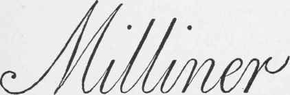
Fig. 87.
fact of the script character should always be kept within, rather than up to, the maximum, as the work never looks well when the down strokes are too thick.
As a rule, the capitals should be at least double the height of the line of the other letters, and the long letters such as 1, d, etc., should be nearly up to the same level, whilst the tails or loops of letters such as g or p should extend the same distance below the line, the letter t being just half the height of the general letters above the line. Thus if the body of a line of writing on an architrave were to be 6 inches, the capitals and long letters should be 12 inches high, whilst the latter should descend 6 inches below the line, and the letter t should be 9 inches high. It adds, however, to the dignity of the writing to give the capitals still greater height, but the long letters should never exceed the proportions laid down, whilst they may, if required, be rather shortened.
Great care is necessary in forming the turns in writing characters, so that the junctions of the up and down strokes may be gracefully accomplished, the down strokes must be drawn to their exact slant until near the turning, they must not be kept, as it were, bending in their whole length, nor on the other hand must the bend take place too suddenly.
It is not advisable either to give the appearance of thickness, or to shade writing characters, for the lightness and elegance of the work is much diminished by either process.
A very elegant style of writing, called the Italian, is well adapted for inscriptions where the business is one of a refined character.
It is in fact to such inscriptions that the script character seems specially adapted, the heavier or more solid characters being better suited to trades with which they harmonize.
This idea cannot of course be carried out to its full extent, as the sign-painter is greatly in the hands of his employer, but it seems clear that there should be a certain consonance between the trade and the inscription, for instance, an inscription in church text must evidently be better adapted to the shop of a bookseller, a clerical robe-maker, or a Bible warehouse, than over a shoemaker's, a butcher's, or a toy store, while the character of the writing should as far as possible accord with the style of architecture of the store front or building on which it is executed.
Continue to:


My Books

