Light And Shade
Description
This section is from the book "Cyclopedia Of Architecture, Carpentry, And Building", by James C. et al. Also available from Amazon: Cyclopedia Of Architecture, Carpentry And Building.
Light And Shade
Values. If several lines are drawn parallel and quite close together, but not touching, a gray, or half-tone value is the result.
Lines drawn so close together that the ink of one runs into that of the other, with little or no white space between, give a black value. The white of the paper untouched by the pen gives a white value. Fig. 5 shows only two values-black and white; Fig. 6 also has two,-gray and white; Fig. 7 has the three,-black, gray and white. The first is harsh, the second is pale, and the third seems most satisfactory.
This is a safe rule to follow -get into every pen drawing, black, gray and white. Usually, in early attempts, there is a tendency to omit the black. Look for the place in the drawing where you can locate this black; you are not likely to get too much, of it. Let the half tone or gray be rather light, midway in strength between white and black. A heavy half tone is a dangerous value. The black may often grade off into the gray, or there may be distinct fields or areas of each value.
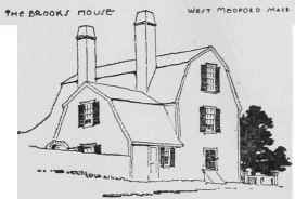
Fig. 5. BLACK AND WHITE.

Fig. 6. GRAY AND WHITE.

Fig. 7. BLACK, GRAY AND WHITE.
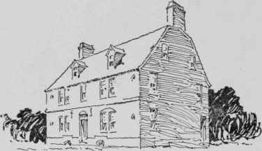
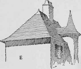
Fig. 8. ONE SIDE IN SHADE.
Lighting. The first thing to consider in the rendering of an architectural subject is the choosing of the direction of light. Sometimes when the building is turned well to the front, showing a sharp return of the end, it may be best to put that side in shade, Fig. 8, but it is not necessary. Values may be obtained by other means such as by shadows, or color of material. It is not wise to attempt a heavy rendering in pen work. Usually it is safer to keep both sides of the building in light as shown in two of these sketches, Figs. 9 and 10.

Fig. 9. ALL IN LIGHT.
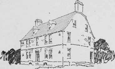
Fig. 10. ALL IN LIGHT WITH HALF-TONE VALUE TO ROOF.
Color of Material. One of the means by which values may be introduced into a rendering, is by considering the color of the material of which the building is constructed.

Fig. 11. HALF-TONE WALLS.
In this example, Fig. 11, we may first use the brick walls as a place to locate a gray value. In the second example, Fig. 12, the roof is used for the same value. For the very dark or black value we must depend on the shadows. Neither one of these drawings is wholly satisfactory. In the first, the roof, and in the other, the walls, seem too glaringly white. For that reason it is not always best to use the material color so broadly. To give color to both walls and roof would destroy the white value, and the white value must not be lost. Fig. 13 shows an attempt at a compromise.
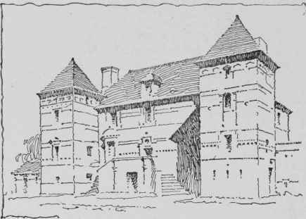
Fig. 12. HALF-TONE ROOF.

Fig. 13. A COMPROMISE.
Shadows Only. The simplest means for obtaining values is by the use of shadows. Sometimes the shadows alone will complete a drawing in a very satisfactory manner, as in Fig. 14. Some of the shadows may be made gray, and others black or nearly so, in order to get the needed variety in values.
A building like that shown in Fig. 15, The Alden House, is not favorable to shadows only. It has no porch or other projection sufficiently large to cast a strong shadow. In such a case a little accessory helps one out of the difficulty, and a little rendering of the material gives needed half tone. Otherwise the drawing would be too white.
Principality or Accent. We now enter into a matter of composition. One simple rule will be given and there is none more useful. Let there be one place in the drawing where a strong accent of black shall exist. It may be one black, or it may be a group of them. This accent will be found in nearly every illustration in this paper. It is usually best to get the accent in the building itself, by the aid of some large shadow perhaps, but when there is no chance for this it may. be necessary to get it in an accessory such as foliage. This is shown in Fig. 16, a drawing of a barn. In connection with this black accent let there be a large white area if possible. A principal white, as well as a principal black is thus obtained. Most drawings permit the dark accent and the light area also.
Fig. 14. SHADOWS ONLY.
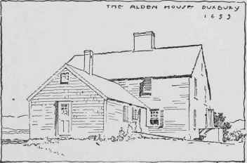
Fig. 15.

Fig 17.
Fig 17 is rendered to a greater extent than should be at-tempted by the student in this course, but it may be helpful to call attention to some things in its composition.

Fig. 16.
The location of the dark accent is apparent in the trees at the left. The other blacks, the trees in front of the building and those down at the extreme right, simply repeat in diminishing force and size, this first dark accent. The light area of the drawing is as distinctly shown as the dark accent; in fact this large light is the feature of this rendering. The light brick rendering of the gable is necessary to confine the light a little more surely to the important portion of the wall. Also, if this light rendering were omitted the building would appear unpleasantly white.
The half tone of the roof is necessary to give a soft contrast to the light wall surface. The sky has its use. Cover it up, and see how the whole subject slumps downward.
Last, but not least, observe that the corners of the drawing are kept free from rendering. This is usually safe. Let the rendering of every sort gather about the central object. The corners of a drawing may then be left to take care of themselves.
Continue to:
My Books

